⚡️Super-fast Tree view with drag-and-drop reordering, multi-selection capabilities, using checkboxes and search filtering.










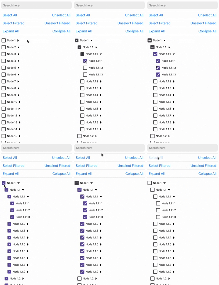 |
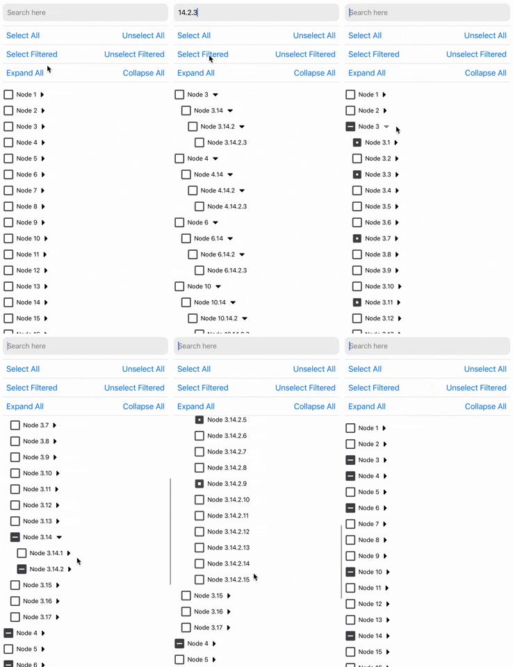 |
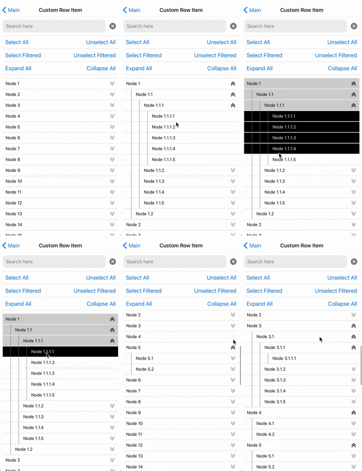 |
 |
 |
 |
Using yarn:
yarn add react-native-tree-multi-selectusing npm:
npm install react-native-tree-multi-selectDependencies that need to be installed for this library to work:
- @shopify/flash-list
- Icon Library (One of the following):
- For Expo Apps (including Expo Go): No additional setup is needed. This library automatically uses
@expo/vector-icons, which is included in the Expo SDK. - For Non-Expo React Native Apps: Install react-native-vector-icons (
>=7.1.0) to enable icon support.
- For Expo Apps (including Expo Go): No additional setup is needed. This library automatically uses
Make sure to follow the native-related installation instructions for these dependencies if you are using bare workflow.
- ⚡ Fast: Designed with performance in mind for smooth scrolling and quick selections.
- 🛠️ Highly Customizable: Modify styles, behavior, and use your custom list component to suit your application's needs.
- 🔍 Filterable: Quickly filter through tree nodes and option to select and un-select only the filtered tree nodes.
- ✅ Well Tested: Comprehensive test coverage to ensure reliability and stability.
- 📚 Well Documented: Detailed documentation to get you started and an example app to demo all the features.
- 🌳 Multi-Level Selection: Select individual nodes or entire branches with ease.
- 📦 Supports Large Datasets: Efficiently handles large trees without much performance degradation.
- 🔒 TypeScript Support: Full TypeScript support for better developer experience.
- 🔀 Drag-and-Drop: Long-press to drag nodes and reorder or nest them anywhere in the tree.
- 💻 Cross-Platform: Works seamlessly across iOS, Android, and web (with React Native Web).
Note: Drag-and-drop is fully supported on iOS and Android. Web support is a work in progress, so drag-and-drop is disabled by default on web - pass
dragAndDrop={{ enabled: true }}to opt in there.
import {
  TreeView,
  type TreeNode,
  type TreeViewRef
} from 'react-native-tree-multi-select';

// Refer to the Properties table below or the example app for the TreeNode type
const myData: TreeNode[] = [...];

export function TreeViewUsageExample(){
  const treeViewRef = React.useRef<TreeViewRef | null>(null);

  // It's recommended to use debounce for the search function (refer to the example app)
  function triggerSearch(text: string){
    // Pass search text to the tree along with the keys on which search is to be done(optional)
    treeViewRef.current?.setSearchText(text, ["name"]);
  }

  // Callback functions for check and expand state changes:
  const handleSelectionChange = (
      _checkedIds: string[],
      _indeterminateIds: string[]
  ) => {
      // NOTE: Handle _checkedIds and _indeterminateIds here
  };
  const handleExpanded = (expandedIds: string[]) => {
    // NOTE: Do something with updated expandedIds here
  };

  // Expand collapse calls using ref
  const expandAllPress = () => treeViewRef.current?.expandAll?.();
  const collapseAllPress = () => treeViewRef.current?.collapseAll?.();
  const expandNodes = (idsToExpand: string[]) => treeViewRef.current?.expandNodes?.(
    idsToExpand
  );
  const collapseNodes = (idsToCollapse: string[]) => treeViewRef.current?.collapseNodes?.(
    idsToCollapse
  );

  // Multi-selection function calls using ref
  const onSelectAllPress = () => treeViewRef.current?.selectAll?.();
  const onUnselectAllPress = () => treeViewRef.current?.unselectAll?.();
  const onSelectAllFilteredPress = () => treeViewRef.current?.selectAllFiltered?.();
  const onUnselectAllFilteredPress = () => treeViewRef.current?.unselectAllFiltered?.();
  const selectNodes = (idsToExpand: string[]) => treeViewRef.current?.selectNodes?.(
    idsToSelect
  );
  const unselectNodes = (idsToCollapse: string[]) => treeViewRef.current?.unselectNodes?.(
    idsToUnselect
  );

  return(
    // ... Remember to keep a fixed height for the parent. Read Flash List docs to know why
    <TreeView
      ref={treeViewRef}
      data={myData}
      onCheck={handleSelectionChange}
      onExpand={handleExpanded}
    />
  );
}import {
TreeView,
moveTreeNode,
type TreeNode,
type TreeViewRef,
type DragEndEvent
} from 'react-native-tree-multi-select';
const myData: TreeNode[] = [...];
export function DragDropExample(){
const [data, setData] = React.useState<TreeNode[]>(myData);
const treeViewRef = React.useRef<TreeViewRef | null>(null);
const handleDragEnd = (event: DragEndEvent) => {
// `event` is a lightweight move delta (draggedNodeId, targetNodeId, position,
// previous/new parent + index) - not the whole tree. For a controlled tree,
// reconstruct it with the exported `moveTreeNode` helper:
setData(prev => moveTreeNode(prev, event.draggedNodeId, event.targetNodeId, event.position));
// Or, if you keep the tree inside the component, read it on demand:
// setData(treeViewRef.current?.getTreeData() ?? prev);
};
return(
<TreeView
ref={treeViewRef}
data={data}
onCheck={(checked, indeterminate) => { /* ... */ }}
onExpand={(expanded) => { /* ... */ }}
dragAndDrop={{
onDragEnd: handleDragEnd,
}}
/>
);
}Long-press a node to start dragging. Drag over other nodes to see drop indicators. Drop above/below to reorder as siblings, or drop inside a parent node to nest it. The tree auto-scrolls when dragging near the edges.
Search + drag: Drag-and-drop is disabled while a search filter is active (long-press does not initiate a drag). The filtered view hides nodes that still exist in the full tree, so a drop position that looks unambiguous on screen could land the node next to hidden siblings. Clear the search to reorder interactively, or use the imperative moveNode ref method, which works regardless of the active filter.
Accessibility: When a screen reader is active, picking up, moving, and cancelling a drag are announced (via AccessibilityInfo). For a fully assistive-tech-driven reorder (without the long-press gesture), wire your own accessibility actions to the imperative moveNode ref method.
For visual customizations (overlay styles, indicator colors, or fully custom components), see the dragAndDrop.customizations option.
The TreeViewProps interface defines the properties for the tree view component.
| Property | Type | Required | Description |
|---|---|---|---|
data |
TreeNode<ID = string>[] |
Yes | An array of TreeNode objects |
onCheck |
(checkedIds: ID[], indeterminateIds: ID[]) => void |
No | Callback when a checkbox state changes |
onExpand |
(expandedIds: ID[]) => void |
No | Callback when a node is expanded |
preselectedIds |
ID[] |
No | An array of ids that should be pre-selected |
preExpandedIds |
ID[] |
No | An array of ids that should be pre-expanded |
selectionPropagation |
SelectionPropagation | No | Control Selection Propagation Behavior. Choose whether you want to auto-select children or parents. |
initialScrollNodeID |
ID |
No | Set node ID to scroll to intiially on tree view render. |
indentationMultiplier |
number |
No | Indentation (marginStart) per level (defaults to 15) |
treeFlashListProps |
TreeFlatListProps | No | Props for the flash list |
checkBoxViewStyleProps |
BuiltInCheckBoxViewStyleProps | No | Props for the checkbox view |
CheckboxComponent |
ComponentType<CheckBoxViewProps> |
No | A custom checkbox component. |
ExpandCollapseIconComponent |
ComponentType<ExpandIconProps> |
No | A custom expand/collapse icon component |
ExpandCollapseTouchableComponent |
ComponentType<TouchableOpacityProps> |
No | A custom expand/collapse touchable component |
CustomNodeRowComponent |
React.ComponentType<NodeRowProps<ID>> |
No | Custom row item component |
dragAndDrop |
DragAndDropOptions<ID> |
No | Drag-and-drop configuration (see below) |
| Property | Type | Required | Description |
|---|---|---|---|
enabled |
boolean |
No | Enable drag-and-drop reordering. Default: true on iOS/Android when dragAndDrop is provided, false on web (WIP). Set explicitly to override per platform. |
onDragStart |
(event: DragStartEvent<ID>) => void |
No | Callback fired when a drag operation begins |
onDragEnd |
(event: DragEndEvent<ID>) => void |
No | Callback fired after a node is successfully dropped at a new position |
onDragCancel |
(event: DragCancelEvent<ID>) => void |
No | Callback fired when a drag is cancelled without a successful drop |
longPressDuration |
number |
No | Long press duration in ms to start drag (default: 400) |
autoScrollThreshold |
number |
No | Distance from edge (px) to trigger auto-scroll (default: 60) |
autoScrollSpeed |
number |
No | Speed multiplier for auto-scroll (default: 1.0) |
dragOverlayOffset |
number |
No | Overlay offset from the finger, in item-height units (default: -2, i.e. two rows above finger) |
overlayYCorrection |
number |
No | Advanced: extra vertical correction for the overlay, in item-height units, added on top of dragOverlayOffset. Compensates for Android reporting touch locationY differently from iOS. Default: -2 on Android, 0 elsewhere. |
autoExpandDelay |
number |
No | Delay in ms before auto-expanding a collapsed node during drag hover (default: 800) |
autoExpand |
boolean |
No | Auto-expand a collapsed node while hovering "inside" it during a drag (default: true). Set false to disable hover-to-expand. |
magneticSnap |
boolean |
No | Animate the overlay with a magnetic "snap" spring when the drop level changes (default: true). Set false to keep the overlay tracking the level without the spring (e.g. for reduced-motion). |
customizations |
DragDropCustomizations<ID> |
No | Customizations for drag-and-drop visuals (overlay, indicator, opacity) |
canDrop |
(draggedNode, targetNode, position) => boolean |
No | Callback to determine if a node can be dropped on a specific target |
maxDepth |
number |
No | Maximum nesting depth allowed, as a 0-based level index (e.g. maxDepth: 2 permits levels 0, 1, and 2 - three visible depths). Drops that would exceed it are suppressed. |
canNodeHaveChildren |
(node: TreeNode<ID>) => boolean |
No | Callback to determine if a node can accept children |
canDrag |
(node: TreeNode<ID>) => boolean |
No | Callback to determine if a node can be dragged (default: all nodes) |
autoScrollToDroppedNode |
boolean | DropAutoScrollOptions |
No | Auto-scroll to the dropped node after a successful drop, if it ended up outside the viewport (no scroll happens when the node is already visible). Pass false to disable, true for defaults, or an object to customize. Default: { enabled: true, animated: true, viewPosition: 0.5 } |
-
The
IDtype parameter allows flexibility in specifying the type of node identifiers (e.g.,string,number, or custom types). -
ℹ️ If
CustomNodeRowComponentis provided then below props are not applied:indentationMultipliercheckBoxViewStylePropsCheckboxComponentBuiltInCheckBoxViewStylePropsExpandCollapseIconComponentExpandCollapseTouchableComponentdragAndDrop.customizations.draggedNodeOpacity/invalidTargetOpacity- the custom component receivesisDraggedNode,isInvalidDropTarget, andisDraggingprops and is responsible for its own drag-state visuals.
-
⚠️ If the tree view doesn't scroll if rendered in a complex nested scroll view/s then try setting therenderScrollComponentvalue intreeFlashListPropstoScrollViewfromreact-native-gesture-handler.
The TreeNode interface defines the properties for individual item of the tree view
| Property | Type | Required | Description |
|---|---|---|---|
id |
ID (default: string) |
Yes | Unique identifier for the node |
name |
string |
Yes | The display name of the node |
children |
TreeNode<ID>[] |
No | An array of child TreeNode<ID> objects |
[key: string] |
any |
No | Any additional properties for the node (May be useful to perform search on) |
The TreeViewRef interface defines the properties for the ref object of the tree view component
| Property | Type | Description |
|---|---|---|
selectAll |
() => void |
Selects all nodes |
unselectAll |
() => void |
Unselects all nodes |
selectAllFiltered |
() => void |
Selects all filtered nodes |
unselectAllFiltered |
() => void |
Unselects all filtered nodes |
expandAll |
() => void |
Expands all nodes |
collapseAll |
() => void |
Collapses all nodes |
expandNodes |
(ids: ID[]) => void |
Expands specified nodes |
collapseNodes |
(ids: ID[]) => void |
Collapses specified nodes |
selectNodes |
(ids: ID[]) => void |
Selects specified nodes |
unselectNodes |
(ids: ID[]) => void |
Unselects specified nodes |
setSearchText |
(searchText: string, searchKeys?: string[]) => void |
Set the search text and optionally the search keys. Default search key is "name" Recommended to call this inside a debounced function if you find any performance issue otherwise. |
scrollToNodeID |
(params: ScrollToNodeParams<ID>) => void; |
Scrolls the tree view to the node of the specified ID. |
getChildToParentMap |
() => Map<ID, ID> |
Get the child to parent tree view map. |
getTreeData |
() => TreeNode<ID>[] |
Get the current (live, reordered) tree data held by the component. Handy after a drag or moveNode to read the full tree without it being pushed through a move event. Returns a live internal reference - treat it as read-only; clone it (e.g. via the exported moveTreeNode or structuredClone) before mutating, or you will desync the internal maps. |
moveNode |
(nodeId: ID, targetNodeId: ID, position: DropPosition, options?: { validate?: boolean; scrollToNode?: boolean | DropAutoScrollOptions }) => MoveResult<ID> | null |
Programmatically move a node. Returns a lightweight MoveResult delta, or null if the move was a no-op / invalid (e.g. onto itself or, with { validate: true }, blocked by canDrop / maxDepth / canNodeHaveChildren). { validate: true } only enforces those rules when a dragAndDrop prop is configured (they live on it); without one, validate is ignored (a dev warning is logged) and the move proceeds. Pass { scrollToNode: true } to scroll the moved node into view. Does not fire onDragEnd. Useful for undo/redo or external state management. |
| Property | Type | Required | Description |
|---|---|---|---|
nodeId |
ID |
Yes | Node ID to expand and scroll to. |
expandScrolledNode |
boolean |
No | Whether to expand scrolled node to reveal its children. Defaults to false. |
animated |
boolean |
No | Control if scrolling should be animated. |
viewOffset |
number |
No | A fixed number of pixels to offset the scrolled node position. |
viewPosition |
number |
No | A value of 0 places the scrolled node item at the top, 1 at the bottom, and 0.5 centered in the middle. |
The SelectionPropagation interface defines the selection propagation behaviour of the tree view
| Property | Type | Required | Description |
|---|---|---|---|
toChildren |
boolean |
No | Whether to propagate selection to children nodes. Defaults to true. |
toParents |
boolean |
No | Whether to propagate selection to parent nodes. Defaults to true. |
All properties of FlashListProps(from @shopify/flash-list) except for data and renderItem
This interface allows you to customize the style of the built-in checkbox component that is rendered in the tree view by default. Overriden if CustomNodeRowComponent is used.
| Property | Type | Required | Description |
|---|---|---|---|
outermostParentViewStyle |
StyleProp<ViewStyle> |
No | Optional style modifier for the outermost parent view. |
checkboxParentViewStyle |
StyleProp<ViewStyle> |
No | Optional style modifier for the checkbox parent view. |
textTouchableStyle |
StyleProp<ViewStyle> |
No | Optional style modifier for the text touchable style. |
checkboxProps |
CheckboxProps | No | Optional props for the checkbox component. |
textProps |
TextProps (React Native) |
No | Optional props for the text component. |
All properties of CheckboxProps(from @futurejj/react-native-checkbox) except for onPress and status
| Property | Type | Required | Description |
|---|---|---|---|
value |
CheckboxValueType | Yes | The current value of the checkbox |
onValueChange |
(value: boolean) => void |
Yes | Function to be called when the checkbox is pressed |
text |
string |
Yes | The display text besides the checkbox |
Type: boolean OR "indeterminate"
| Property | Type | Required | Description |
|---|---|---|---|
| isExpanded | boolean | Yes | Indicates if the icon is expanded |
| Property | Type | Required | Description |
|---|---|---|---|
node |
TreeNode | Yes | The node to be rendered |
level |
number |
Yes | The depth of the node in the tree |
checkedValue |
CheckboxValueType | Yes | The current value of the checkbox |
isExpanded |
boolean |
Yes | Whether the node is expanded or not |
onCheck |
() => void |
Yes | Function to be called when the checkbox is pressed |
onExpand |
() => void |
Yes | Function to be called when the expand button is pressed |
isInvalidDropTarget |
boolean |
No | Whether this node is an invalid drop target during drag |
isDropTarget |
boolean |
No | Whether this node is the current valid drop target |
dropPosition |
DropPosition |
No | The drop position if this node is the current drop target |
isDragging |
boolean |
No | Whether a drag operation is in progress |
isDraggedNode |
boolean |
No | Whether this node is the one being dragged |
dragHandleProps |
DragHandleProps | No | Touch handlers to spread on a drag handle element. Only present when drag-and-drop is enabled. Attach to a specific View to make only that area initiate drag, or spread on the root for whole-row drag. |
Touch handlers to spread on a drag handle element within a custom node row.
| Property | Type | Required | Description |
|---|---|---|---|
onTouchStart |
(e: GestureResponderEvent) => void |
Yes | Touch start handler for drag |
onTouchEnd |
() => void |
Yes | Touch end handler |
onTouchCancel |
() => void |
Yes | Touch cancel handler |
The event object passed to the onDragStart callback when a drag begins.
| Property | Type | Description |
|---|---|---|
draggedNodeId |
ID |
The id of the node being dragged |
A lightweight description of a completed move. Returned by the moveNode ref method and passed to the onDragEnd callback (i.e. DragEndEvent is an alias of MoveResult). It carries only the move delta - not a full tree copy - so you can update external state or persist the change cheaply. To get the full reordered tree, call the getTreeData ref method or reconstruct it with the exported moveTreeNode helper.
| Property | Type | Description |
|---|---|---|
draggedNodeId |
ID |
The id of the node that was moved |
targetNodeId |
ID |
The id of the target node the move was relative to |
position |
DropPosition | Where relative to the target: above/below = sibling, inside = child |
previousParentId |
ID | null |
Parent id before the move (null if it was a root-level node) |
newParentId |
ID | null |
Parent id after the move (null if it is now a root-level node) |
previousIndex |
number |
Index within the previous parent's children (or the root array) |
newIndex |
number |
Index within the new parent's children (or the root array) |
The event object passed to the onDragEnd callback after a successful drop. This is an alias of MoveResult<ID> - see its fields above.
The event object passed to the onDragCancel callback when a drag is cancelled without a successful drop.
| Property | Type | Description |
|---|---|---|
draggedNodeId |
ID |
The id of the node that was being dragged |
Type: "above" | "below" | "inside"
Options for auto-scrolling to the dropped node after a successful drop. Uses the same scroll parameters as scrollToNodeID.
| Property | Type | Required | Description |
|---|---|---|---|
enabled |
boolean |
No | Enable auto-scroll to the dropped node (default: true) |
animated |
boolean |
No | Whether the scroll should be animated (default: true) |
viewOffset |
number |
No | Fixed offset from the target position (in pixels) |
viewPosition |
number |
No | Position in the viewport: 0 = top, 0.5 = center, 1 = bottom (default: 0.5) |
Customizations for drag-and-drop visuals.
| Property | Type | Required | Description |
|---|---|---|---|
draggedNodeOpacity |
number |
No | Opacity of the node being dragged (default: 0.3) |
invalidTargetOpacity |
number |
No | Opacity of invalid drop targets during drag (default: 0.3) |
dropIndicatorStyleProps |
DropIndicatorStyleProps | No | Style props for the built-in drop indicator |
dragOverlayStyleProps |
DragOverlayStyleProps | No | Style props for the drag overlay (lifted node ghost) |
CustomDropIndicatorComponent |
ComponentType<DropIndicatorComponentProps> |
No | Fully custom drop indicator component |
CustomDragOverlayComponent |
ComponentType<DragOverlayComponentProps<ID>> |
No | Fully custom drag overlay component |
Style props for customizing the built-in drop indicator appearance.
| Property | Type | Required | Description |
|---|---|---|---|
lineColor |
string |
No | Color of the line indicator for above/below (default: "#0078FF") |
lineThickness |
number |
No | Thickness of the line indicator (default: 3) |
circleSize |
number |
No | Diameter of the circle at the line's start (default: 10) |
highlightColor |
string |
No | Background color of the "inside" highlight (default: "rgba(0, 120, 255, 0.15)") |
highlightBorderColor |
string |
No | Border color of the "inside" highlight (default: "rgba(0, 120, 255, 0.5)") |
highlightBorderWidth |
number |
No | Border width of the "inside" highlight box (default: 2) |
highlightBorderRadius |
number |
No | Corner radius of the "inside" highlight box (default: 4) |
Style props for customizing the drag overlay (the "lifted" node ghost).
| Property | Type | Required | Description |
|---|---|---|---|
backgroundColor |
string |
No | Background color (default: "rgba(255, 255, 255, 0.95)") |
shadowColor |
string |
No | Shadow color (default: "#000") |
shadowOffset |
{ width: number; height: number } |
No | Shadow offset, iOS (default: { width: 0, height: 2 }) |
shadowOpacity |
number |
No | Shadow opacity (default: 0.25) |
shadowRadius |
number |
No | Shadow radius (default: 4) |
elevation |
number |
No | Android elevation (default: 10) |
zIndex |
number |
No | Stacking order of the overlay (default: 9999) |
style |
StyleProp<ViewStyle> |
No | Custom style applied to the overlay container |
Props passed to a custom drop indicator component (when using CustomDropIndicatorComponent).
| Property | Type | Required | Description |
|---|---|---|---|
position |
DropPosition | Yes | Whether the indicator is above, below, or inside the target |
level |
number |
Yes | The nesting level of the target node (useful for indenting) |
indentationMultiplier |
number |
Yes | Pixels per nesting level |
Props passed to a custom drag overlay component (when using CustomDragOverlayComponent).
| Property | Type | Required | Description |
|---|---|---|---|
node |
TreeNode<ID> |
Yes | The node being dragged |
level |
number |
Yes | The nesting level of the node |
checkedValue |
CheckboxValueType | Yes | The current checkbox value of the node |
moveTreeNode<ID>(
  data: TreeNode<ID>[],
  draggedNodeId: ID,
  targetNodeId: ID,
  position: DropPosition
): TreeNode<ID>[]
Moves a node within a tree structure. Returns a new tree (no mutation). Useful if you want to perform tree moves manually outside of the onDragEnd callback.
- Row Item full-customization
- Prop to control auto children and parents selection. Can now be done using
selectionPropagationprop 🎉 - Prop to set the maximum checked item limit
- Prop to disable certain nodes from getting checked
- Ref function to programatically expand/collapse a certain node
- Ref function to programatically un/check a certain node
- Ref function to auto-scroll to a certain node's position - available in 1.9.0+
- Drag-and-drop reordering with customizable visuals. Can now be done using
dragAndDropprop 🎉
If you do not see what you want in the planned feature list, raise a feature request.
- Radio button like selection in tree view: Snack link
- Display count of number of checked nodes: Snack link
See the contributing guide to learn how to contribute to the repository and the development workflow.
MIT


- Module built using create-react-native-library
- To allow super fast list rendering @shopify/flash-list
- Super easy state management done using zustand
- Readme is edited using Typora
- Example app uses @gorhom/showcase-template