This package is a comprehensive Flutter solution that enables you to easily implement calendar UI and calendar event functionality in your applications.
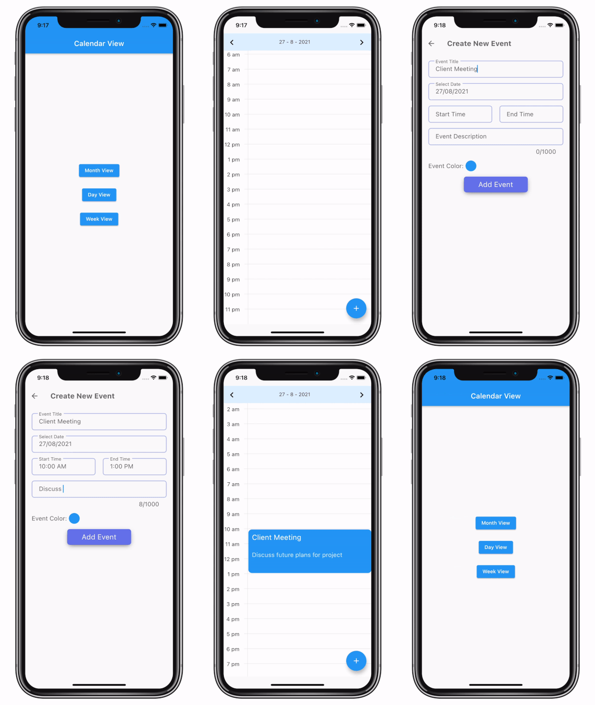
- Multiple calendar view options:
- Month View
- Day View
- Week View
- Highly customisable UI components
- Manage events (add, remove, update)
- Manage reminders (add, remove, update)
- Manage full-day events (add, remove, update)
- Show working days in week view and day views
- Sync event data between multiple views
This package provides a complete set of tools for implementing calendar functionality in your Flutter application, with extensive customization options to match your app's design and user experience requirements.
For a live web demo, visit Calendar View Example.
Follow these steps to add the calendar_view package to your Flutter project:
Add this to your package's pubspec.yaml file:
dependencies:
  calendar_view: <latest-version>
Get the latest version in the 'Installing' tab on pub.dev.
Run the following command:
flutter pub getAdd the following import to your Dart code:
import 'package:calendar_view/calendar_view.dart';Now you're ready to use the calendar_view package in your Flutter application!
This guide covers the fundamental setup and implementation of the calendar_view package.
First, wrap your MaterialApp with CalendarControllerProvider and assign an EventController to it:
CalendarControllerProvider(
    controller: EventController(),
    child: MaterialApp(
        // Your initialization for material app.
    ),
)Scaffold(
body: MonthView(),
);Scaffold(
body: DayView(),
);Scaffold(
body: WeekView(),
);final event = CalendarEventData(
date: DateTime(2021, 8, 10),
event: "Event 1",
);
CalendarControllerProvider.of(context).controller.add(event);final event = CalendarEventData(
date: DateTime(2021, 8, 10),
endDate: DateTime(2021, 8, 15),
event: "Event 1",
);
CalendarControllerProvider.of(context).controller.add(event);CalendarControllerProvider.of(context).controller.remove(event);As soon as you add or remove events from the controller, it will automatically update the calendar view assigned to that controller.
This guide covers more advanced features and customization options for the calendar_view package.
MonthView(
    controller: EventController(),
    // Custom UI for month cells
    cellBuilder: (date, events, isToday, isInMonth, hideDaysNotInMonth) {
        // Return your widget to display as month cell.
        return Container();
    },
    minMonth: DateTime(1990),
    maxMonth: DateTime(2050),
    initialMonth: DateTime(2021),
    cellAspectRatio: 1,
    onPageChange: (date, pageIndex) => print("$date, $pageIndex"),
    onCellTap: (events, date) {
        // Implement callback when user taps on a cell.
        print(events);
    },
    startDay: WeekDays.sunday, // To change the first day of the week.
    // Event callbacks
    onEventTap: (event, data) => print('on tap'),
    onEventTapDetails: (event, data, details) => print('on tap details'),
    onEventDoubleTap: (event, data) => print('on double tap'),
    onEventDoubleTapDetails: (event, data, details) =>
      print('on double details'),
    onEventLongTap: (event, data) => print('on long tap'),
    onEventLongTapDetails: (event, data, details) =>
      print('on long tap details'),
    onDateLongPress: (date) => print(date),
    headerBuilder: MonthHeader.hidden, // To hide month header
    showWeekTileBorder: false, // To show or hide header border
    hideDaysNotInMonth: true, // To hide days or cell that are not in current month
    showWeekends: false, // To hide weekends default value is true
);DayView(
controller: EventController(),
eventTileBuilder: (date, events, boundry, start, end) {
// Return your widget to display as event tile.
return Container();
},
fullDayEventBuilder: (events, date) {
// Return your widget to display full day event view.
return Container();
},
showVerticalLine: true, // To display live time line in day view.
showLiveTimeLineInAllDays: true, // To display live time line in all pages in day view.
minDay: DateTime(1990),
maxDay: DateTime(2050),
initialDay: DateTime(2021),
heightPerMinute: 1, // height occupied by 1 minute time span.
eventArranger: SideEventArranger(), // To define how simultaneous events will be arranged.
onEventTap: (events, date) => print(events),
onEventDoubleTap: (events, date) => print(events),
onEventLongTap: (events, date) => print(events),
onDateLongPress: (date) => print(date),
startHour: 5, // To set the first hour displayed (ex: 05:00)
endHour: 20, // To set the end hour displayed
hourLinePainter: (lineColor, lineHeight, offset, minuteHeight, showVerticalLine, verticalLineOffset) {
return // Your custom painter.
},
dayTitleBuilder: DayHeader.hidden, // To Hide day header
keepScrollOffset: true, // To maintain scroll offset when the page changes
);WeekView(
controller: EventController(),
eventTileBuilder: (date, events, boundry, start, end) {
// Return your widget to display as event tile.
return Container();
},
fullDayEventBuilder: (events, date) {
// Return your widget to display full day event view.
return Container();
},
showLiveTimeLineInAllDays: true, // To display live time line in all pages in week view.
width: 400, // width of week view.
minDay: DateTime(1990),
maxDay: DateTime(2050),
initialDay: DateTime(2021),
heightPerMinute: 1, // height occupied by 1 minute time span.
eventArranger: SideEventArranger(), // To define how simultaneous events will be arranged.
onEventTap: (events, date) => print(events),
onEventDoubleTap: (events, date) => print(events),
onDateLongPress: (date) => print(date),
startDay: WeekDays.sunday, // To change the first day of the week.
startHour: 5, // To set the first hour displayed
endHour: 20, // To set the end hour displayed
showVerticalLines: false, // Show the vertical line between days.
hourLinePainter: (lineColor, lineHeight, offset, minuteHeight, showVerticalLine, verticalLineOffset) {
return // Your custom painter.
},
weekPageHeaderBuilder: WeekHeader.hidden, // To hide week header
fullDayHeaderTitle: 'All day', // To set full day events header title
fullDayHeaderTextConfig: FullDayHeaderTextConfig(
textAlign: TextAlign.center,
textOverflow: TextOverflow.ellipsis,
maxLines: 2,
), // To set full day events header text config
keepScrollOffset: true, // To maintain scroll offset when the page changes
liveTimeIndicatorSettings: LiveTimeIndicatorSettings(
color: Colors.red,
showTime: true,
// Support for different timezones - provide custom DateTime function
currentTimeProvider: () {
final utcNow = DateTime.now().toUtc();
return utcNow.subtract(Duration(hours: 4));
},
),
);You can configure the week view to display only specific days:
WeekView(
  weekDays: [
    WeekDays.monday,
    WeekDays.tuesday,
    WeekDays.wednesday,
    WeekDays.thursday,
    WeekDays.friday,
  ],
);
The above code will create a WeekView with only five days, from Monday to Friday.
There are two ways to synchronize events between calendar views:
- Provide the same
controllerobject to all calendar views used in the project. - Wrap MaterialApp with
CalendarControllerProviderand provide controller as an argument.
This guide explains how to enable and configure localization in the calendar_view package to support multiple languages in your Flutter application.
The package provides a flexible localization system that allows you to:
- Display calendar strings (AM/PM, weekday names, etc.) in different languages
- Support right-to-left (RTL) layouts for languages like Arabic and Hebrew
- Customize number formatting for different locales
- Dynamically switch between languages at runtime
The package includes 8 pre-configured languages out of the box:
| Language | Code | RTL | Localized Numbers |
|---|---|---|---|
| English | en |
No | No |
| Spanish (Español) | es |
No | No |
| Arabic (العربية) | ar |
Yes | Yes (٠-٩) |
| French (Français) | fr |
No | No |
| German (Deutsch) | de |
No | No |
| Hindi (हिन्दी) | hi |
No | Yes (०-९) |
| Chinese (简体中文) | zh |
No | No |
| Japanese (日本語) | ja |
No | No |
You can use these built-in languages directly without any configuration!
import 'package:calendar_view/calendar_view.dart';

void main() {
  // Switch to Spanish
  PackageStrings.setLocale('es');

  // Switch to Arabic (includes RTL and Arabic numerals)
  PackageStrings.setLocale('ar');

  // Switch to Hindi (includes Devanagari numerals)
  PackageStrings.setLocale('hi');

  runApp(MyApp());
}If you need a language that isn't built-in, you can easily add it:
import 'package:calendar_view/calendar_view.dart';

void main() {
  // Add Portuguese
  PackageStrings.addLocaleObject(
    'pt',
    CalendarLocalizations(
      am: 'AM',
      pm: 'PM',
      more: 'Mais',
      weekdays: ['S', 'T', 'Q', 'Q', 'S', 'S', 'D'],
    ),
  );

  // Add Russian
  PackageStrings.addLocaleObject(
    'ru',
    CalendarLocalizations(
      am: 'ДП',
      pm: 'ПП',
      more: 'Ещё',
      weekdays: ['П', 'В', 'С', 'Ч', 'П', 'С', 'В'],
    ),
  );

  // Switch to custom language
  PackageStrings.setLocale('pt');

  runApp(MyApp());
}You can override any built-in language with custom values:
// Override the built-in Spanish with full weekday names
PackageStrings.addLocaleObject(
  'es',
  CalendarLocalizations(
    am: 'a. m.',
    pm: 'p. m.',
    more: 'Ver más',
    weekdays: ['Lun', 'Mar', 'Mié', 'Jue', 'Vie', 'Sáb', 'Dom'],
  ),
);

PackageStrings.setLocale('es');You can access built-in localizations directly from PackageStrings:
CalendarLocalizations spanish = PackageStrings.spanish;
CalendarLocalizations arabic = PackageStrings.arabic;
CalendarLocalizations french = PackageStrings.french;
CalendarLocalizations german = PackageStrings.german;
// Set to Spanish
PackageStrings.setLocale('es');
// Set to Arabic
PackageStrings.setLocale('ar');
// Set back to English (default)
PackageStrings.setLocale('en');A class that holds all localizable strings for the calendar.
const CalendarLocalizations({
  required String am,             // AM suffix (e.g., 'am', 'a. m.')
  required String pm,             // PM suffix (e.g., 'pm', 'p. m.')
  required String more,           // "More" text for additional events
  required List<String> weekdays, // Weekday abbreviations [Mon-Sun]
  List<String>? numbers,          // Localized numbers 0-60 (61 elements)
  bool isRTL = false,             // Right-to-left layout
});
Note: If you provide a numbers array, it must contain exactly 61 elements (representing numbers 0 through 60) for calendar usage (dates, hours, minutes).
You can also create localizations from a Map (useful for loading from JSON/ARB files):
factory CalendarLocalizations.fromMap(Map<String, dynamic> map)The package includes a built-in English locale:
CalendarLocalizations.en // English (default)A static class for managing calendar localizations at runtime.
| Method | Description |
|---|---|
addLocaleObject(String locale, CalendarLocalizations localeObj) |
Register a new locale |
setLocale(String locale) |
Set the active locale |
localizeNumber(int number) |
Convert a number to localized string |
| Property | Description |
|---|---|
currentLocale |
Get the current CalendarLocalizations object |
selectedLocale |
Get the current locale code (e.g., 'en', 'es') |
Here's a complete example showing how to integrate localization with Flutter's built-in localization system:
import 'dart:ui';
import 'package:calendar_view/calendar_view.dart';
import 'package:flutter/material.dart';
import 'package:flutter_localizations/flutter_localizations.dart';

void main() {
  runApp(MyApp());
}

class MyApp extends StatefulWidget {
  @override
  State<MyApp> createState() => _MyAppState();
}

class _MyAppState extends State<MyApp> {
  String _currentLocale = 'en';

  @override
  void initState() {
    super.initState();
    // Initialize calendar localizations
    _initializeCalendarLocales();
  }

  void _initializeCalendarLocales() {
    // Register Spanish
    PackageStrings.addLocaleObject(
      'es',
      CalendarLocalizations(
        am: 'a. m.',
        pm: 'p. m.',
        more: 'Más',
        weekdays: ['L', 'M', 'X', 'J', 'V', 'S', 'D'],
      ),
    );

    // Register Arabic with RTL
    PackageStrings.addLocaleObject(
      'ar',
      CalendarLocalizations.fromMap({
        'am': 'ص',
        'pm': 'م',
        'more': 'المزيد',
        'weekdays': ['ن', 'ث', 'ر', 'خ', 'ج', 'س', 'ح'],
        'numbers': ['٠', '١', '٢', '٣', '٤', '٥', '٦', '٧', '٨', '٩'],
        'isRTL': true,
      }),
    );
  }

  void _changeLocale(String locale) {
    setState(() {
      _currentLocale = locale;
      PackageStrings.setLocale(locale);
    });
  }

  @override
  Widget build(BuildContext context) {
    return CalendarControllerProvider(
      controller: EventController(),
      child: MaterialApp(
        locale: Locale(_currentLocale),
        localizationsDelegates: [
          GlobalMaterialLocalizations.delegate,
          GlobalCupertinoLocalizations.delegate,
          GlobalWidgetsLocalizations.delegate,
        ],
        supportedLocales: [
          Locale('en', ''),
          Locale('es', ''),
          Locale('ar', ''),
        ],
        home: Scaffold(
          appBar: AppBar(
            title: Text('Calendar Localization Demo'),
            actions: [
              PopupMenuButton<String>(
                onSelected: _changeLocale,
                itemBuilder: (context) => [
                  PopupMenuItem(value: 'en', child: Text('English')),
                  PopupMenuItem(value: 'es', child: Text('Español')),
                  PopupMenuItem(value: 'ar', child: Text('العربية')),
                ],
              ),
            ],
          ),
          body: MonthView(),
        ),
      ),
    );
  }
}The default theme supports dark mode. Refer this colors to override it.
| Name | Parameter | Default color |
|---|---|---|
MonthView Border color |
Color? borderColor | colorScheme.surfaceContainerHigh |
WeekView Background color of week view page |
Color? backgroundColor | colorScheme.surfaceContainerLowest |
DayView Default background color |
Color? backgroundColor | colorScheme.surfaceContainerLow |
FilledCell Dates in month cell color |
Color? backgroundColor | colorScheme.surfaceContainerLowest |
FilledCell Dates not in month cell color |
Color? backgroundColor | colorScheme.surfaceContainerLow |
WeekDayTile Border color |
Color? borderColor | colorScheme.secondaryContainer |
WeekDayTile Background color |
Color? backgroundColor | colorScheme.surfaceContainerHigh |
WeekDayTile Text style color |
TextStyle? textStyle | colorScheme.onSecondaryContainer |
To customise MonthView, DayView & WeekView page header use HeaderStyle.
  headerStyle: HeaderStyle(
        leftIconConfig: IconDataConfig(color: Colors.red),
        rightIconConfig: IconDataConfig(color: Colors.red),
        decoration: BoxDecoration(
          color: Theme.of(context).highlightColor,
        ),
),There are two main ways to customize the theme for calendar views:
-
Using ThemeData extensions:
// Create custom theme
final myMonthViewTheme = MonthViewTheme.light().copyWith(
  cellInMonthColor: Colors.blue.shade50,
  cellBorderColor: Colors.blue.shade300,
);

// Apply to your app theme
final theme = ThemeData.light().copyWith(
  extensions: [
    myMonthViewTheme,
    DayViewTheme.light(),
    WeekViewTheme.light(),
  ],
);
-
Using CalendarThemeProvider:
CalendarThemeProvider(
  calendarTheme: CalendarTheme(
    monthViewTheme: MonthViewTheme.light().copyWith(
      cellInMonthColor: Colors.blue.shade50,
    ),
    dayViewTheme: DayViewTheme.light(),
    weekViewTheme: WeekViewTheme.light(),
  ),
  child: YourApp(),
)
- Default timeline text color is
colorScheme.onSurface.- Use
markingStyleinDefaultTimeLineMarkto give text style.
- Use
- Default
LiveTimeIndicatorSettingscolorcolorScheme.primaryColorLight.- Use
liveTimeIndicatorSettingsto customise it.
- Use
- Default hour, half hour & quarter color is
colorScheme.surfaceContainerHighest.- Use
hourIndicatorSettingsto customise it.
- Use
Default hour indicator settings.
 HourIndicatorSettings(
          height: widget.heightPerMinute,
          // Color of horizontal and vertical lines
          color: Theme.of(context).colorScheme.surfaceContainerHighest,
          offset: 5,
);- To customise week number & weekdays use
weekNumberBuilder&weekDayBuilder. - Default week tile background color is
colorScheme.surfaceContainerHigh.- Use
weekTitleBackgroundColorto change background color.
- Use
- Default page background color is
colorScheme.surfaceContainerLowest.- Use
backgroundColorto change background color.
- Use
- Default timeline text color is
colorScheme.onSurface. UsemarkingStyleinDefaultTimeLineMarkto give text style.- To customise timeline use
timeLineBuilder.
- To customise timeline use
- To change Hour lines color use
HourIndicatorSettings. - To style hours, half hours & quarter hours use
HourIndicatorSettings. Default color used issurfaceContainerHighest - To customise divider between weekdays and full-day events use
dividerSettings.
  hourIndicatorSettings: HourIndicatorSettings(
        color: Colors.greenAccent,
        lineStyle: LineStyle.dashed,
      ),
      showHalfHours: true,
  halfHourIndicatorSettings: HourIndicatorSettings(
        color: Colors.redAccent,
        lineStyle: LineStyle.dashed,
      ),
  dividerSettings: DividerSettings(
        thickness: 2,
        height: 2,
        color: Colors.blueAccent,
      ),
Hide divider in week view.
dividerSettings: DividerSettings.none(),-
Default date cell color in month is
colorScheme.surfaceContainerLowestandcolorScheme.surfaceContainerLowfor days not in month. -
Use
cellBuilderto completely customize the cell appearance:cellBuilder: (date, events, isToday, isInMonth, hideDaysNotInMonth) { return Container( decoration: BoxDecoration( color: isInMonth ? Colors.white : Colors.grey[200], border: Border.all(color: Colors.blue), ), child: Center( child: Text( date.day.toString(), style: TextStyle( color: isToday ? Colors.red : Colors.black, fontWeight: isToday ? FontWeight.bold : FontWeight.normal, ), ), ), ); }
-
Use
showWeekTileBorderto control week day title border visibility -
Use
headerBuilderto customize or completely replace the month header
All 2.x.x releases may include breaking changes. To avoid unexpected issues, do not use the caret (^) when depending on any versions of 2.x.x Instead, pin the exact version.
Example:
dependencies:
calendar_view: 2.0.0- Migrate
HeaderStyle.// Old final style = HeaderStyle( headerTextStyle : TextStyle(), headerMargin : EdgeInsets.zero, headerPadding : EdgeInsets.zero, titleAlign : TextAlign.center, decoration : BoxDecoration(), mainAxisAlignment : MainAxisAlignment.spaceBetween, leftIcon : Icon(Icons.left), rightIcon : Icon(Icons.right), leftIconVisible : true, rightIconVisible : true, leftIconPadding : EdgeInsets.zero, rightIconPadding : EdgeInsets.zero, );
// After Migration

// NOTE: leftIconVisible and rightIconVisible is removed in
// latest version. set leftIconConfig and rightIconConfig null to
// hide the respective icon.
final style = HeaderStyle(
   headerTextStyle : TextStyle(),
   headerMargin : EdgeInsets.zero,
   headerPadding : EdgeInsets.zero,
   titleAlign : TextAlign.center,
   decoration : BoxDecoration(),
   mainAxisAlignment : MainAxisAlignment.spaceBetween,

   // Set this null to hide the left icon.
   leftIconConfig : IconDataConfig(
     padding: EdgeInsets.zero,
     icon: Icon(Icons.left),
   ),

   // Set this null to hide the right icon.
   rightIconConfig :  IconDataConfig(
     padding: EdgeInsets.zero,
     icon: Icon(Icons.right),
   ),
 );
- Migrate
CalendarPageHeader|DayPageHeader|MonthPageHeader|WeekPageHeader:// Old final header = MonthPageBuilder({ date = DateTime.now(), dateStringBuilder = (date, {secondaryDate}) => '$date', backgroundColor = Constants.headerBackground, iconColor = Constants.black, });
   // After Migration
   final header = MonthPageBuilder({
     date = DateTime.now(),
     dateStringBuilder = (date, {secondaryDate}) => '$date',
     headerStyle = HeaderStyle.withSameIcons(
       decoration: BoxDecoration(
         color: Constants.headerBackground,
       ),
       iconConfig: IconDataConfig(
         color: Constants.black,
       ),
     ),
   });
 |
 |
 |
 |
 |
|---|---|---|---|---|
| Vatsal Tanna | Sanket Kachhela | Parth Baraiya | Ujas Majithiya | Rashi Shah |
 |
 |
 |
 |
 |
|---|---|---|---|---|
| Faiyaz Shaikh | Dhaval Kansara | Apurva Kanthraviya | Shubham Jitiya | Sahil Totala |
 |
|---|
| Kavan Trivedi |
We welcome contributions to improve the calendar_view package. Please feel free to submit issues and pull requests to the GitHub repository.
Check out our other available awesome mobile libraries.
MIT License

Copyright (c) 2021 Simform Solutions

Permission is hereby granted, free of charge, to any person obtaining a copy
of this software and associated documentation files (the "Software"), to deal
in the Software without restriction, including without limitation the rights
to use, copy, modify, merge, publish, distribute, sublicense, and/or sell
copies of the Software, and to permit persons to whom the Software is
furnished to do so, subject to the following conditions:

The above copyright notice and this permission notice shall be included in all
copies or substantial portions of the Software.

THE SOFTWARE IS PROVIDED "AS IS", WITHOUT WARRANTY OF ANY KIND, EXPRESS OR
IMPLIED, INCLUDING BUT NOT LIMITED TO THE WARRANTIES OF MERCHANTABILITY,
FITNESS FOR A PARTICULAR PURPOSE AND NON INFRINGEMENT. IN NO EVENT SHALL THE
AUTHORS OR COPYRIGHT HOLDERS BE LIABLE FOR ANY CLAIM, DAMAGES OR OTHER
LIABILITY, WHETHER IN AN ACTION OF CONTRACT, TORT OR OTHERWISE, ARISING FROM,
OUT OF OR IN CONNECTION WITH THE SOFTWARE OR THE USE OR OTHER DEALINGS IN THE
SOFTWARE.