
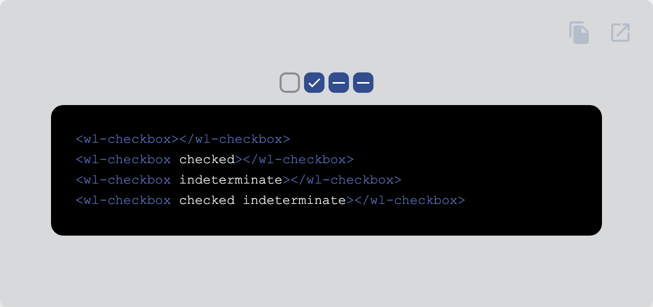
Turn an option on or off.
| Property | Attribute | Type | Default | Description |
|---|---|---|---|---|
ariaChecked |
aria-checked |
string |
Aria checked attribute. | |
checked |
checked |
boolean |
false | Checks the switch. |
disabled |
disabled |
boolean |
false | Disables the element. |
indeterminate |
indeterminate |
boolean |
false | Indeterminate checkbox state. |
name |
name |
string | undefined |
Name of the native form element. | |
readonly |
readonly |
boolean |
false | Makes the element readonly (disabled but tabbable) |
required |
required |
boolean |
false | Makes the element required in a form context. |
role |
role |
AriaRole |
"checkbox" | Role of the switch. |
value |
value |
string |
"" | Value of the form element. |
| Event | Description |
|---|---|
change |
Dispatched when the checked property changes due to a user interaction. |
| Property | Description |
|---|---|
--checkbox-bg |
Background |
--checkbox-bg-checked |
Background when checked |
--checkbox-bg-disabled |
Background when disabled |
--checkbox-bg-disabled-checked |
Background when checked and disabled |
--checkbox-border-config |
Border configuration (width and style) |
--checkbox-border-radius |
Border radius |
--checkbox-checkmark-path-dasharray |
Dasharray of the checkmark |
--checkbox-checkmark-path-delay |
Transition delay of the checkmark animation |
--checkbox-checkmark-path-width |
Width of the checkmark |
--checkbox-checkmark-size |
Width and height of the checkmark |
--checkbox-checkmark-stroke-color |
Color of the checkmark stroke |
--checkbox-checkmark-transition |
Transition of the checkmark |
--checkbox-color |
Color |
--checkbox-color-checked |
Color when checked |
--checkbox-color-disabled |
Color when disabled |
--checkbox-color-disabled-checked |
Color when disabled and checked |
--checkbox-ripple-transform |
Transform of the ripple |
--checkbox-size |
Width and height |
--checkbox-transition |
Transition |
Go here to try the demo.
 |
|
|---|---|
| Andreas Mehlsen | You? |
Licensed under MIT.