
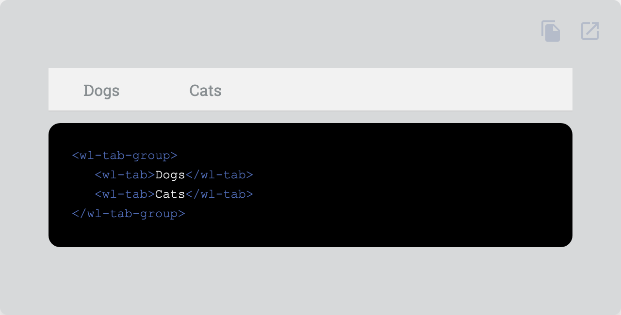
Organize navigation between groups of content.
| Property | Attribute | Type | Default | Description |
|---|---|---|---|---|
align |
align |
TabGroupAlignment |
"start" | Alignment of the tabs. |
filled |
filled |
boolean |
false | Adds a filled color style to the tab. |
role |
role |
AriaRole |
"tablist" | Role of the tab. |
vertical |
vertical |
boolean |
false | Makes the tabs vertical. |
| Name | Description |
|---|---|
| Default content. Add wl-tab elements here. |
| Property | Description |
|---|---|
--tab-group-bg |
Default background |
--tab-group-color |
Default color |
--tab-group-filled-bg |
Background when filled |
--tab-group-filled-color |
Color when filled |
--tab-group-indicator-bg |
Background of the indicator |
--tab-group-indicator-scale |
Scale of the indicator |
--tab-group-indicator-size |
Size of the indicator |
--tab-group-indicator-transition |
Transition of the indicator |
Go here to try the demo.
 |
|
|---|---|
| Andreas Mehlsen | You? |
Licensed under MIT.