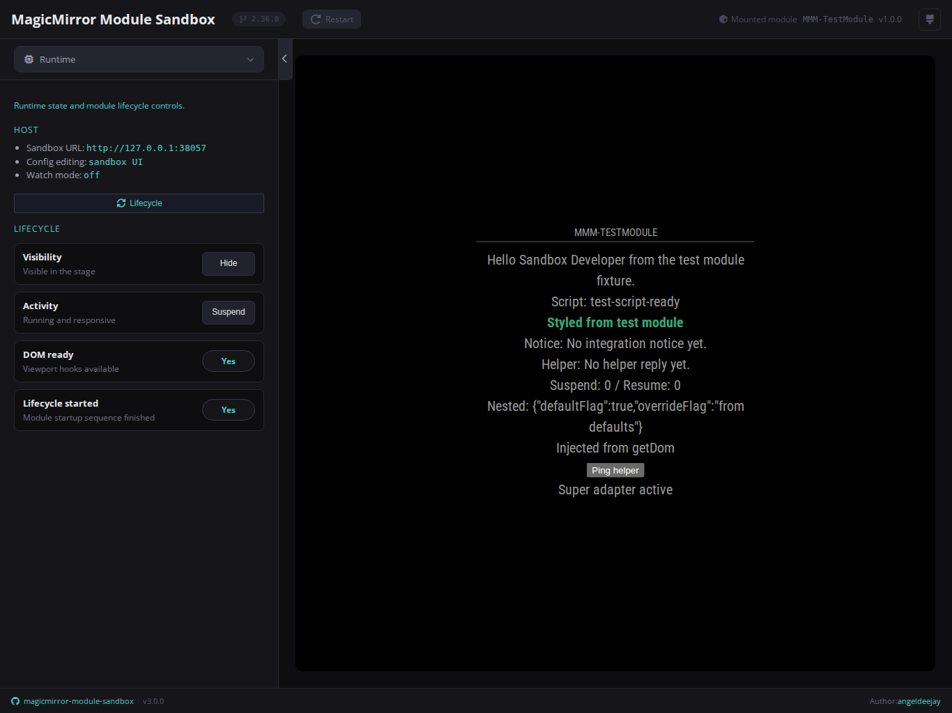
The sandbox ships four built-in themes that change the shell color palette without affecting the mounted module or the stage iframe.
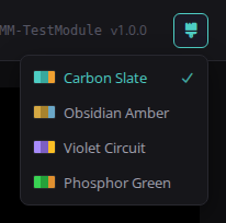
The brush icon button in the topbar opens a dropdown listing all four themes
with color-swatch previews and a check mark on the active selection. The chosen
theme persists across sessions via localStorage — no page reload needed.
The default theme. Deep carbon background with a teal/cyan accent. Designed for long sessions in low-light environments.
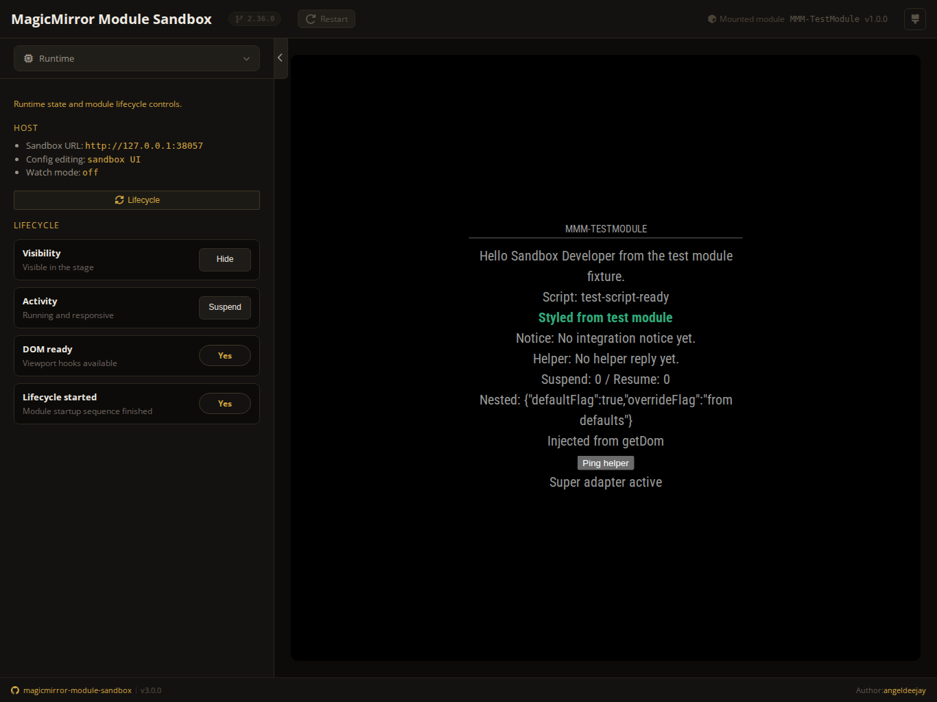
Near-black background with a warm golden amber accent. Reminiscent of classic amber phosphor displays.
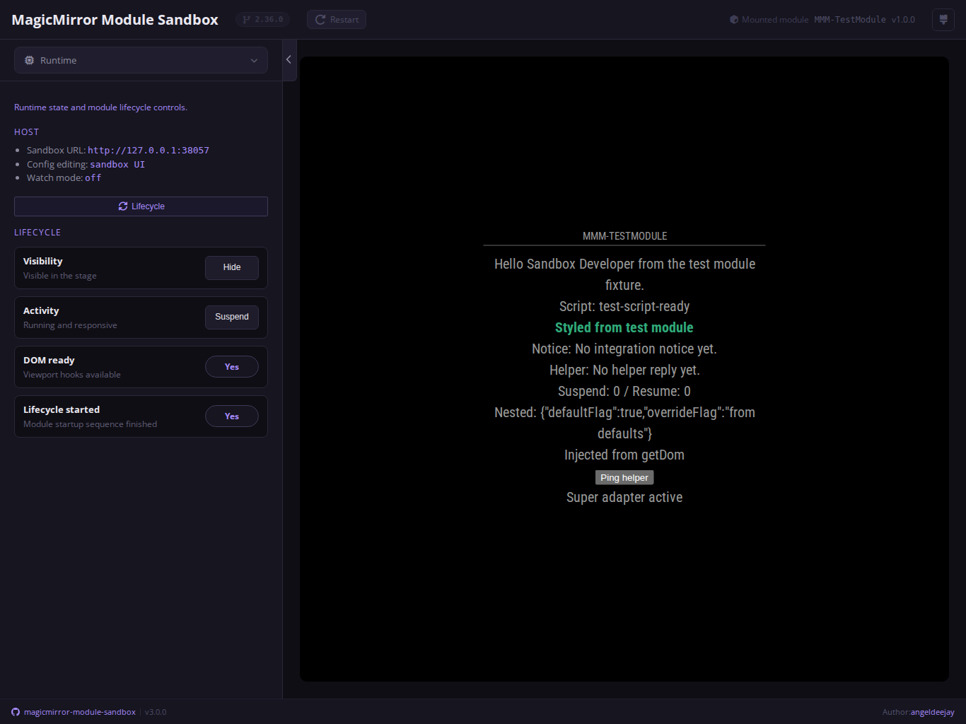
Dark background with a lavender/purple accent. Clean and modern, easy on the eyes for extended use.
Black background with a bright terminal green accent. Evokes classic green phosphor monitors.
- Themes apply only to the sandbox shell UI. The mounted module stage runs inside an isolated iframe and is not affected.
- The active theme is stored under the
harness-themekey inlocalStorageand reapplied server-side on the next page load to prevent a flash of the default theme. - All four themes share the same layout, spacing, and icon set — only the color palette changes.