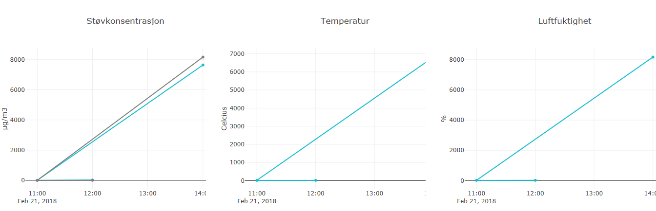
The new graphs on the /historikk site look very weird. It almost looks as if the graph only uses two points resulting in painting a line.
I have also observered instances where my sample dataset rendered as single point, which was quite boring to look at.
The new graphs on the
/historikksite look very weird. It almost looks as if the graph only uses two points resulting in painting a line.I have also observered instances where my sample dataset rendered as single point, which was quite boring to look at.