You signed in with another tab or window. Reload to refresh your session.You signed out in another tab or window. Reload to refresh your session.You switched accounts on another tab or window. Reload to refresh your session.Dismiss alert
Let's learn about Ui via these 174 free blog posts. They are ordered by HackerNoon reader engagement data. Visit the /Learn or LearnRepo.com to find the most read blog posts about any technology.
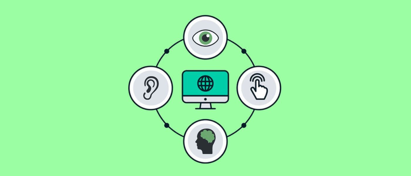
UI stands for User Interface. Want to learn more about it? Check out the latest articles on UI.
If you haven’t been immersed in iOS interface design, you might look at Apple’s icons and think that they’re just a rounded square or a ‘roundrect’. If you’ve been designing icons, you know that they’re something different and may have heard the word squircle used (mathematical intermediate of a square and a circle). And if you’re an Industrial Designer, you recognize this as a core signature of their hardware products.
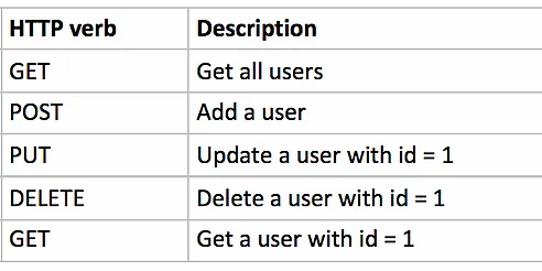
These days REST API has become a web applications development standard, allowing to divide web development into two separate parts. There are several mainstream frameworks like Angular, React, Vue, that are used for UI. Backend developers are free to choose from large variety of languages and frameworks. Today I’d like to discuss NestJS framework. We’re going to create a simple CRUD application using Nest and the @nestjsx/crud package.
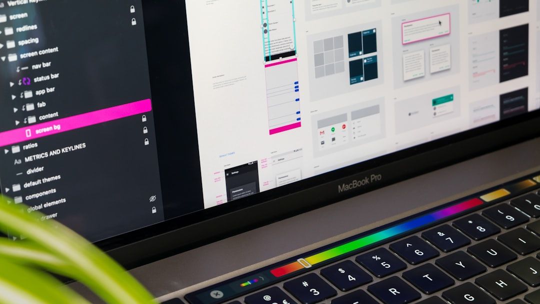
In this part, I’ll explore "UI Polish and Interaction Design" — the process of refining and enhancing visual and interactive aspects of a user interface
GUI design has become the best choice of user interface design. Nevertheless, in spite of the unpredictable popularity of GUI, few application programs have good interface design and live up to graphic user interface design principles. Additionally, it’s extremely difficult to use the expertise and existing documents to explain what an excellent and direct-viewing operation interface is.
Qt is a toolset that helps developers easily make user interfaces, with a long list of popular apps that such as Adobe and Google Earth that have used it.
One of the key elements of SwiftUI is the use of property wrappers. These are functional elements that allow you to provide additional logic for properties.
The React JS dev team announced some exciting changes several months ago - React would be getting a "Concurrent Mode". Essentially this would allow React to perform multiple UI renders concurrently. Of course, JavaScript is single threaded and true concurrency is an illusion, but the new features will allow web apps (and Native Apps once these features hit React Native) to be much more responsive and snappy than they are now with less effort and custom code from the developer to make this happen.
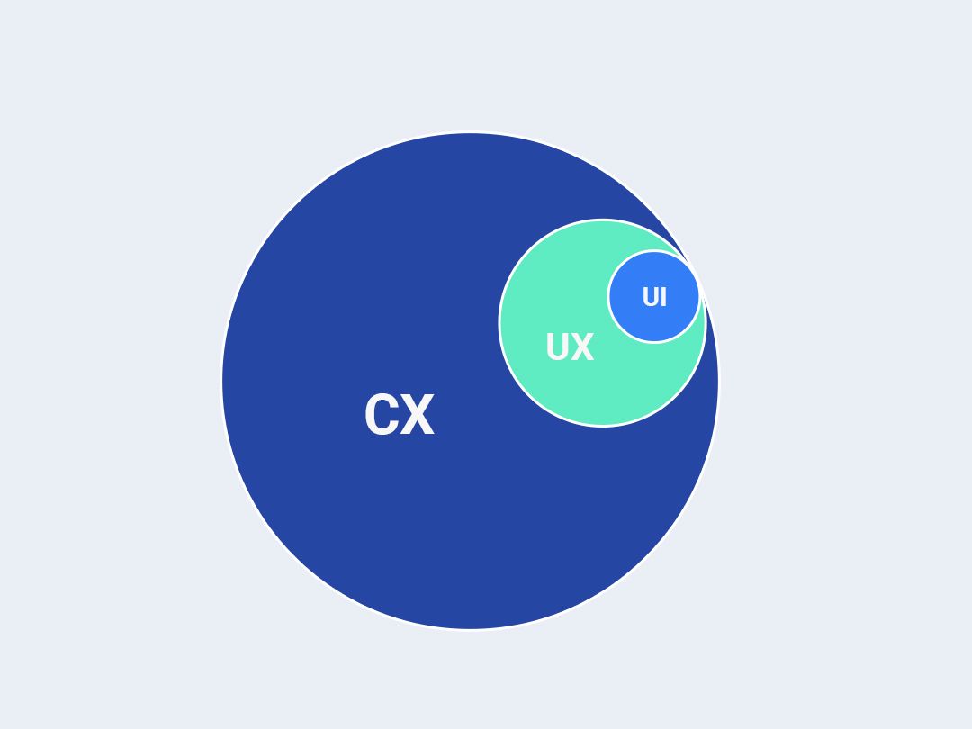
You might have heard user experience (UX), user interface (UI) and customer experience (CX) being used interchangeably. Even some of the most seasoned and professional marketers and designers confuse these terms.
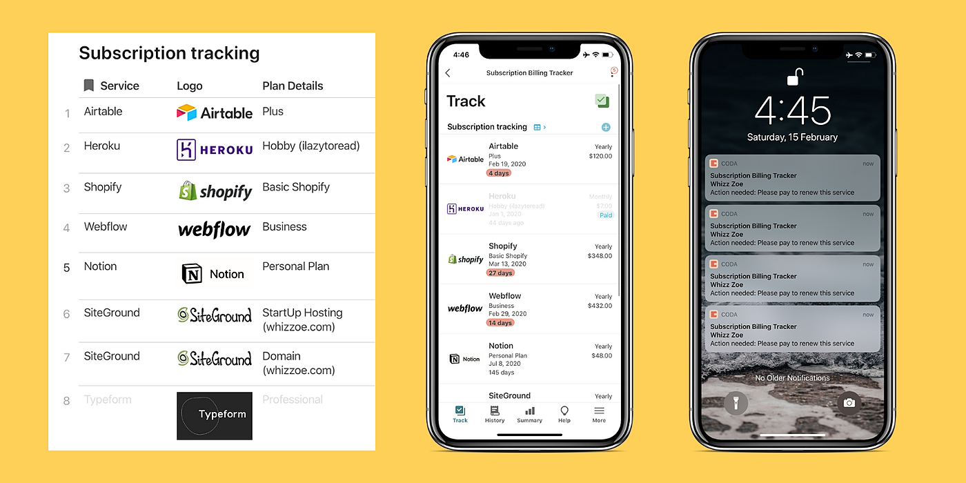
This tutorial shows how a lightweight and performant time-series database coupled with queued status checks and a simple UI are best for robust applications.
One of the things that you end up developing in one point or in the other is a breadcrumbs navigation system. I've seen some posts across the web touting how to achieve it in React and Reach Router by providing complex looping mechanisms. In this post, I show you a simpler, non loop way that displays breadcrumbs in Reach-Router.
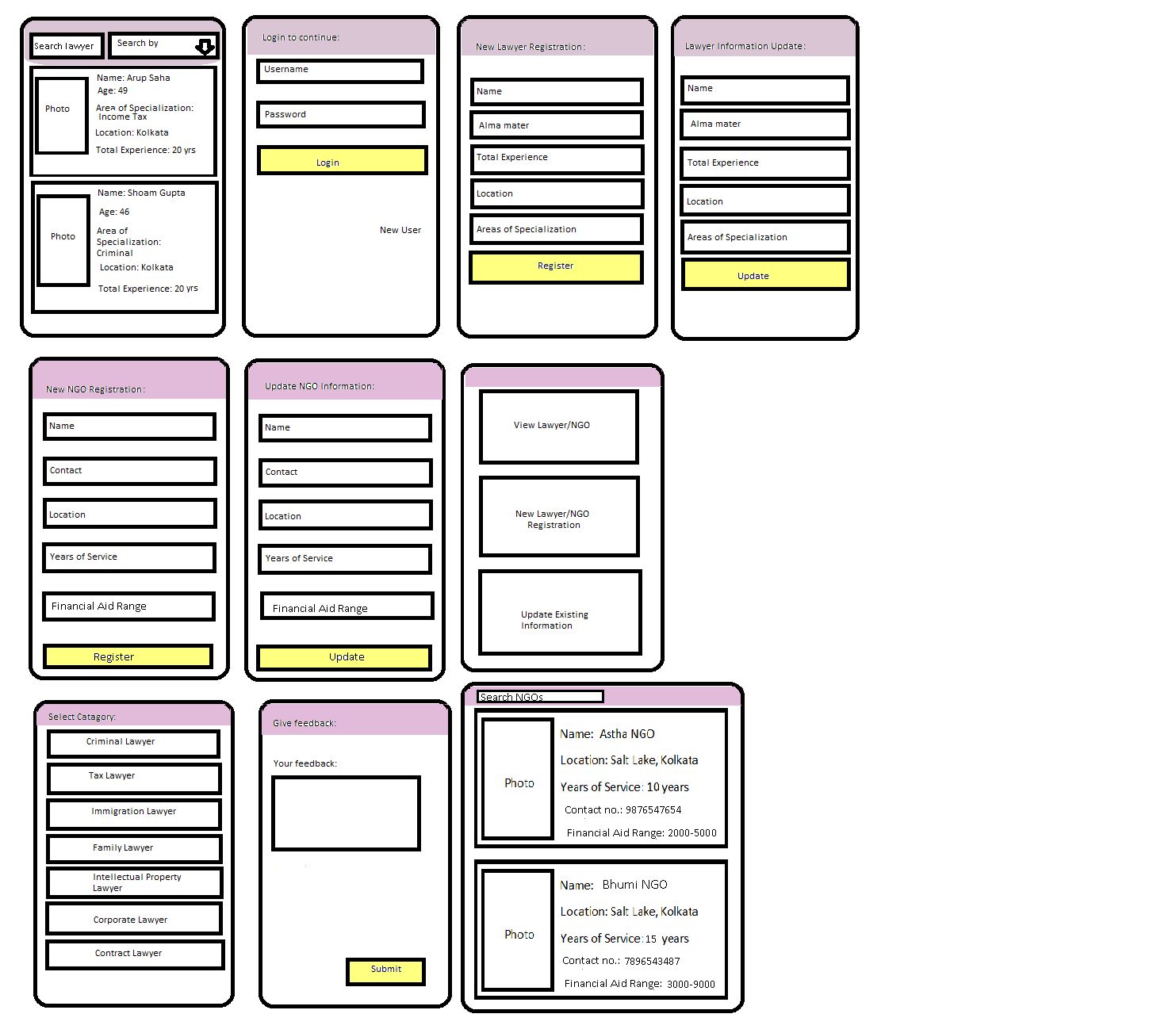
In this article, I'll show the development and code of StatefulUI, a library for developing user interfaces in Unity based on states and element markup.
Using Composite UI in angular is one way to use a multiservice application in the backend that has a few advantages over the conventional, Monolith architecture
I just started learning React Native and I have to admit that, it’s super easy to start with and hot-reloading makes it amazing to develop and reload the application in no time.
The dark UI feature that you have witnessed recently in Android and iOS apps is a good thing; large number of studies have shed some light on the benefits of a dark background.
The traditional comment box at the end of a blog post is not a sufficient way to facilitate reader and writer communication. It falls short in a number of ways:
AI tools give marketers and designers unique opportunities to create a better user experience. We are going to share some actionable tips for getting started.
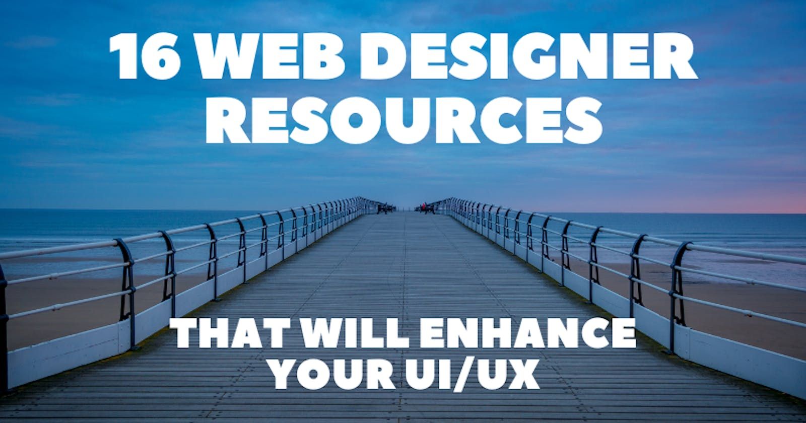
In this article, I've curated 16 essential resources across a variety of domains including icons, illustrations, colors, gradients, fonts, mockups, etc.
The Nextion editor does not have full support for string arrays, so I had to think about how to implement language selection and store "language packs" in a con
Designing the experiment environment to enable A B testing for your product or service. Assign users to different groups and measure results of experiment
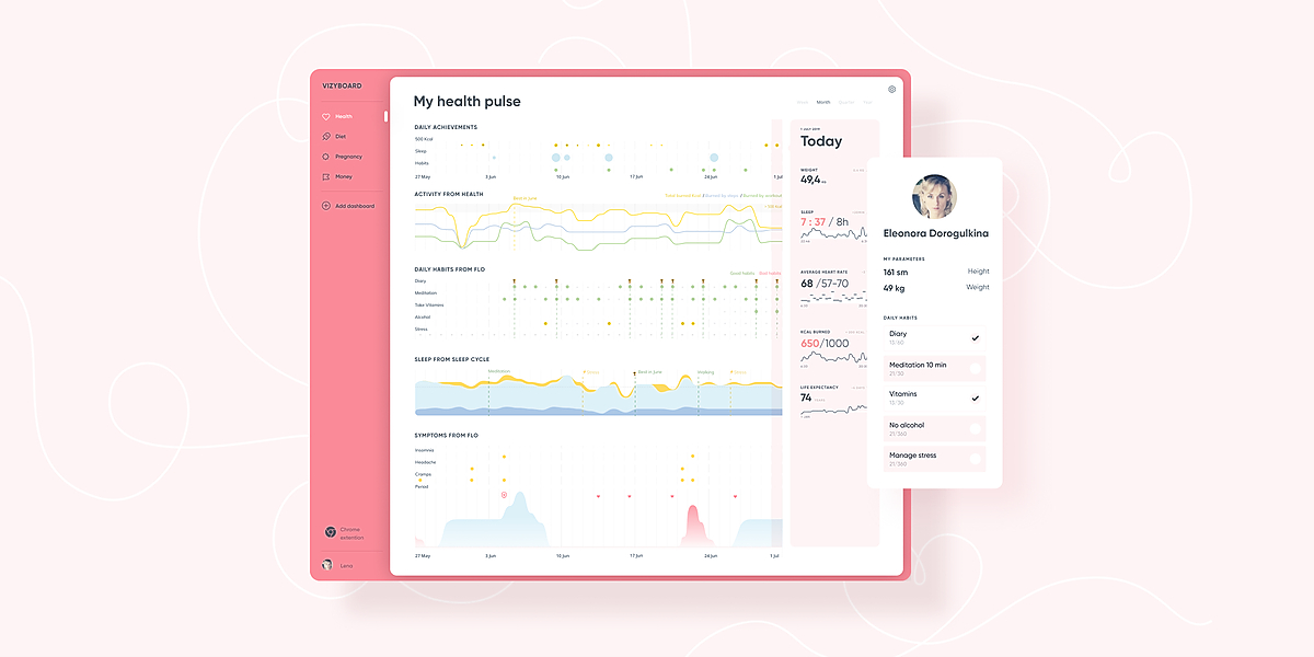
The importance of user experience is more emphasized than ever. As a result, the number and variety of dashboard tools is on the rise. These tools are used as an essential piece in any good customer experience strategy.
Apple has its own way of gaining eyeballs, and this time it's the beta release of iOS 16. While the recently launched iOS version is gaining all the attention, reactions are mixed, with some still wondering whether iOS 16 is worth getting or not. To address the same, I wanted to share an in-depth analysis of newly introduced features and usability.
Typically, domain models and UI views are completely separated. A few years ago, we had a good reason to do so because the views were mostly made of imperative code. But now that we have functional UI libraries (e.g., React with hooks), wouldn't it be possible to gather everything together, and implement the views as methods of the models they represent?
How troubleshooting CI Machines and identifying elements is helpful when testing your iOS UI mockup for your project as well as how to speed up the process.
Sometimes, designers get confused on which design styles to apply to their work. It all depends on what the work is for and who the target audience is.
User experience, or UX, refers to how easily users interact with a product or service. In blockchain technology, a positive user experience can be critical for its adoption because it can determine how readily people are willing to use the technology.
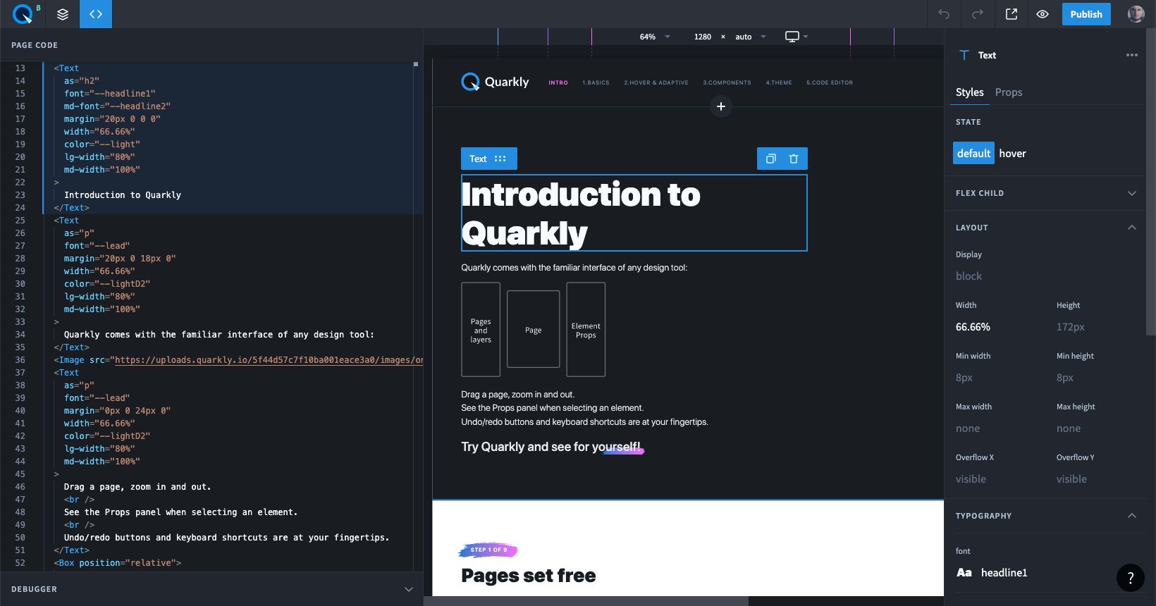
My name is Alex, and I’m a co-founder and lead developer at Quarkly.io. Quarkly is a project made by our small team of designers and developers, aimed at helping similar teams. Our goal with Quarkly is to make the life and workflow of designer-developer pairs easier, allowing them to work both independently and collaboratively, all in one environment.
If you have chosen React for building a web app, you will still need additional technologies and frameworks to expand and grow your project, add functionality and integrations.
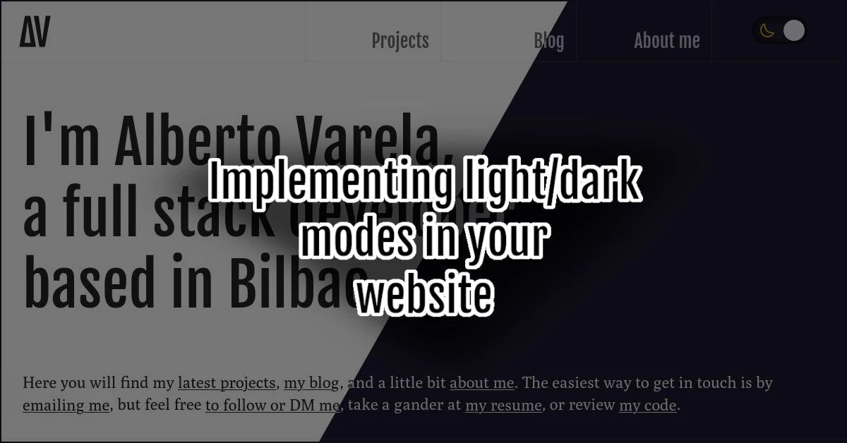
I've recently rebranded and redesigned the look and feel of my website. As a part of that redesign, I've implemented both a light and a dark theme. Here's how.
Software Development is a route that’s proved to be very popular in the last couple of years in tech. From HTML & CSS webinars to Ruby on Rails meet ups, you can’t escape the hype. But what if coding isn’t for you? What if you want to solve problems in Tech without writing code, is there a career out there for you?
Finding the perfect font for a project can be a challenge. It can take a long time to select the correct font. To make the right choice, there are a few things
Some of the most common approaches to solve a problem are situational or context-specific. For example, in the field of structural engineering, most of the challenges are solved by applying time tested rules in the field of civil engineering. For a problem that is considered less severe, a common approach is a trial by error. Mission-critical requirements and issues are solved by using a well-defined set of steps and strategies. The first reaction to solve any problem is to compartmentalize the problem into something which was solved earlier. The mind likes the comfort of the known after all. This is our primordial nature. These approaches have served us since time immemorial and will continue to do so. A common thread running through all these problems is they are well known, and they have been faced before plus they are well documented
This article will explore practical strategies for integrating ChatGPT into your design process to create more intuitive and engaging digital experiences.
A lot of newbies to web development, don’t get it from the first time working with CSS grid. And that is the reason why I decided to write this article, besides that, I also want to give a brief intro to CSS grid and try to explain to people who are new to CSS, how to work with this amazing feature in the simplest way possible.
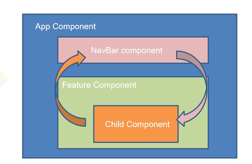
Today, we are going to talk about Angular Component Communication, the last version of Angular is @9, but I will show definitions to communicate in all angular versions, probably it will be in the angular platform for a long time. If you need to start with basic concepts in Angular I recommend for you the tour of heroes tutorial before reading this article.
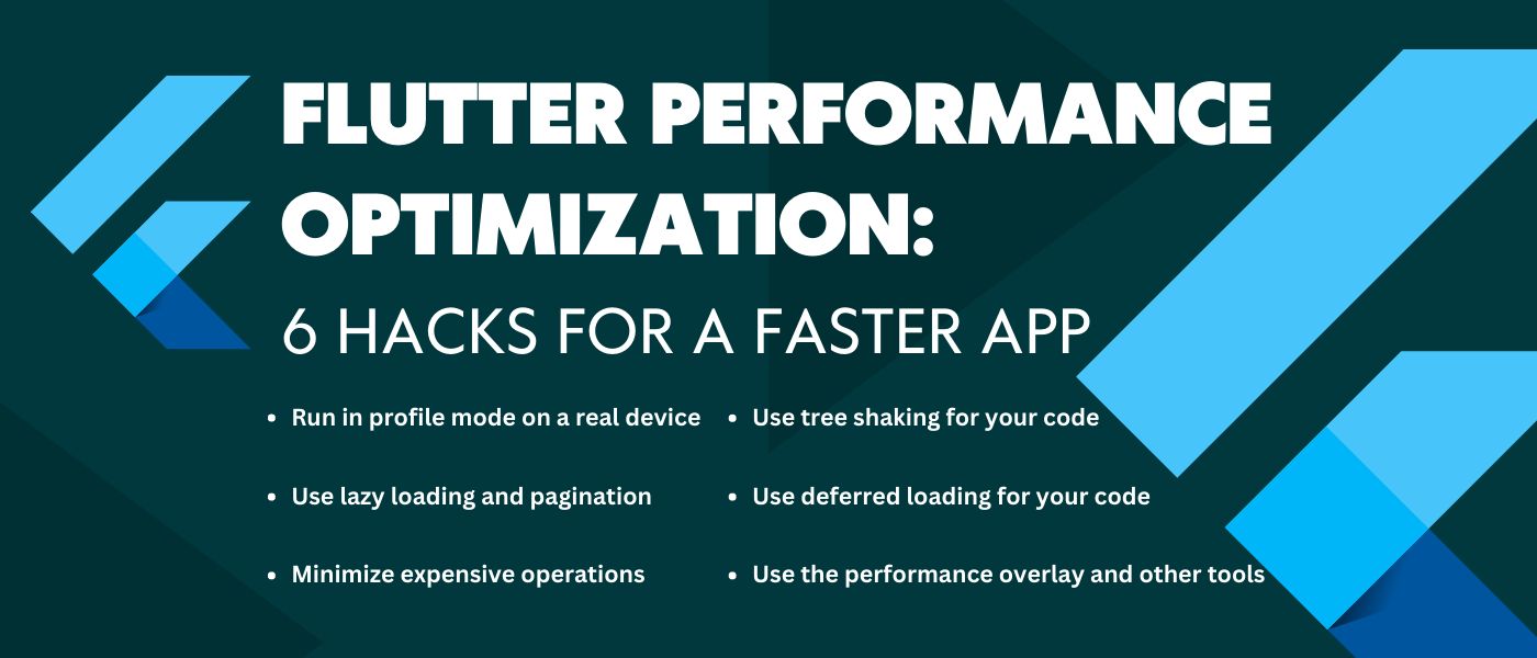
To enhance your Next.js application performance you should prevent typical mistakes while applying essential optimization techniques. Discover methods to reduce
Rio’s two-step approach to layouting, where each component starts by defining its own natural size before the available space is thoughtfully distributed.
The software market is suffocated with new mobile and web apps monthly. That’s why the focus has moved on ensuring a client-centered and visible UI/UX design.
Organizations are looking for web applications that provide users with many unique functionalities. For example, the User Interface is the essential part of a web application for anything they provide.
In this post we talk about the importance of carrying out accessibility tests over systems and mention different tools and techniques to put them into practice.
When it comes to user convenience, understanding consumer habits is as important as the market your app operates in. The ability to combine simple gestures with user-friendly interface results in a solution that appears simple and comprehensive. Mirroring of the physical actions into digital ones is one of the ways to do it.
Visual hierarchy is one of the most important principles behind effective web design. I say this because the goal of a web page is to communicate, and that is essentially the same goal of good visual design.
I moved from Istanbul to LA and found the same Figma files waiting. Reflections on nomadic remote work, timezone pain, and why stability matters for design....
The set of behaviors visitors to a site exhibit constitute the UX. Based on this, design teams create products and sites that provide a meaningful user experience.
Most mobile and cross-platform web developers have encountered the problem at some point: you need your web app to scale neatly to the device screen size, regardless of which of the many thousands of devices there are out there, but your units only have one design layout width, mainly mobile. Or perhaps you need to create a per-device stylesheet for a truly scalable cross-platform UI, and want to use a scaled version of an original to base it upon. In either case, converting everything by hand is laborious and inconvenient.
What interactivity means and why you need it to make immersive products. We’ll also cover what constitutes immersion, and why “user” is an objectifying term.
Robotic Process Automation (RPA) is the technology that allows businesses to configure computer software, or a “robot” to emulate and integrate the actions of a human interacting within digital systems to execute a business process. RPA robots utilize the user interface to capture data and manipulate applications mimicking human actions. They interpret, trigger responses and communicate with other systems in order to perform on a vast variety of repetitive and mundane tasks. What acts in the favor of an RPA software is that unlike humans, robots never sleep, make zero mistakes and costs a lot less than an employee.
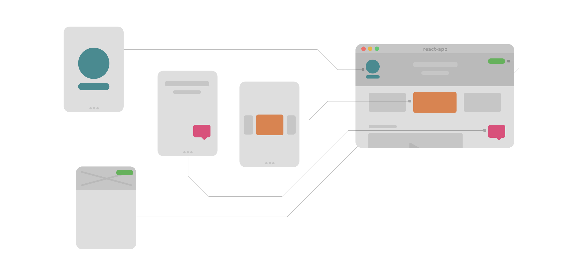
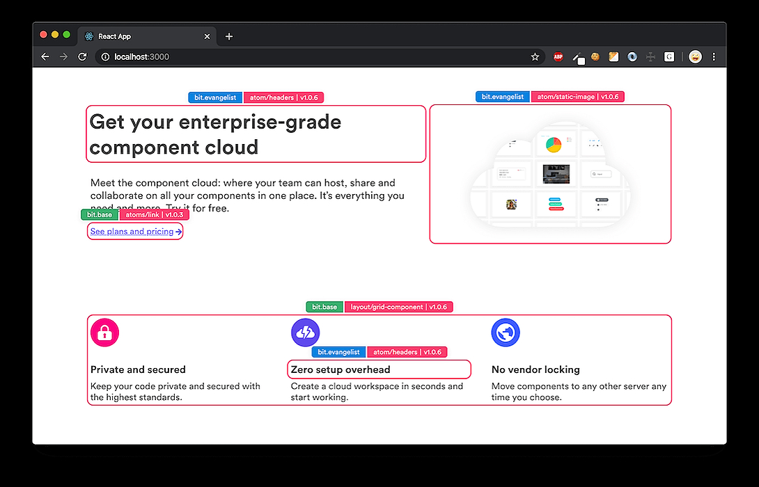
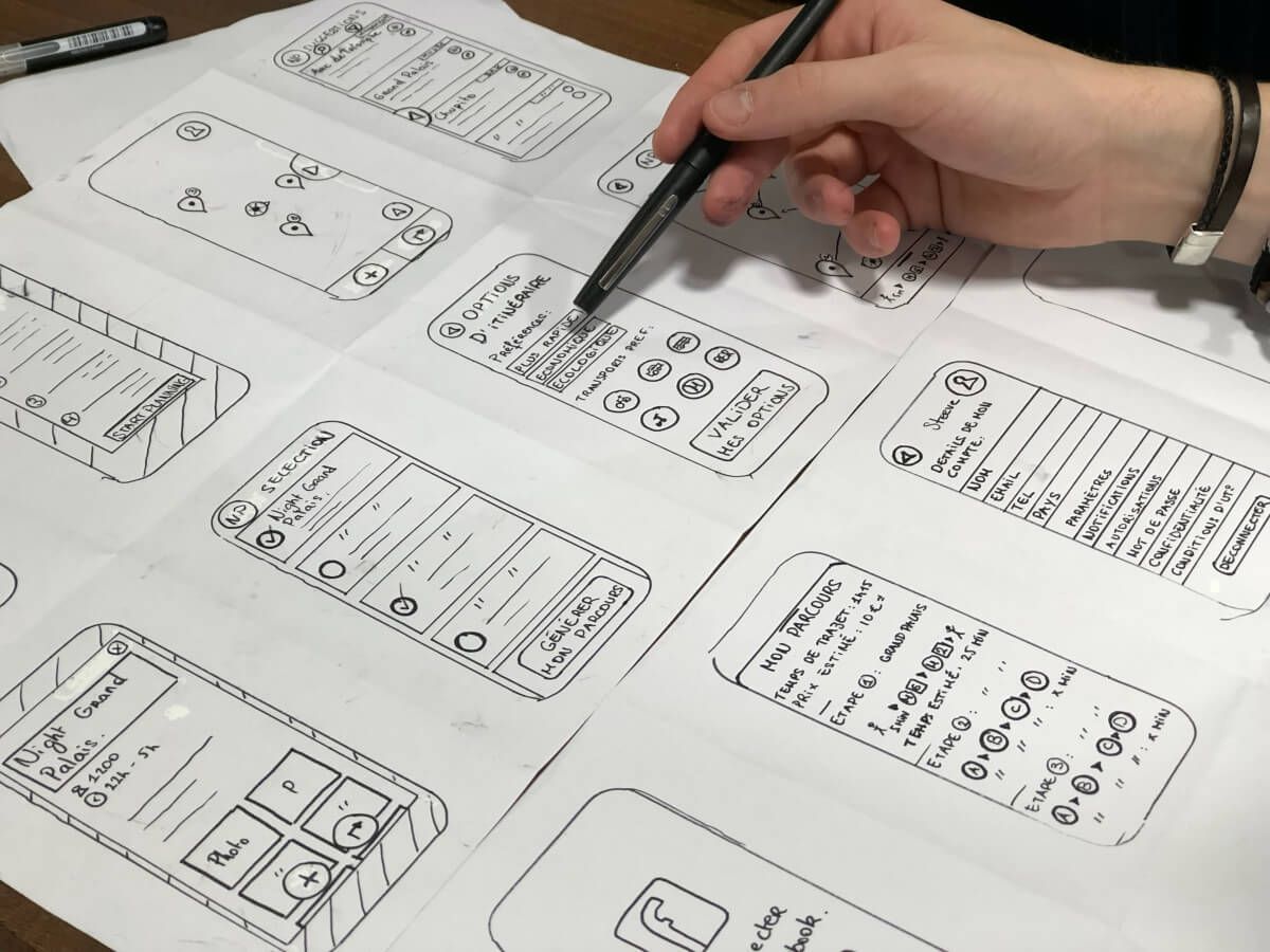
To build an awesome and successful digital product you need to do a lot of things. Such as planning, market research, build a prototype, design it, code it, ship it etc. For this whole process, you need to go through lots of handoffs and team communications. One of the more painful handoffs is the Design-to-Development Handoff.
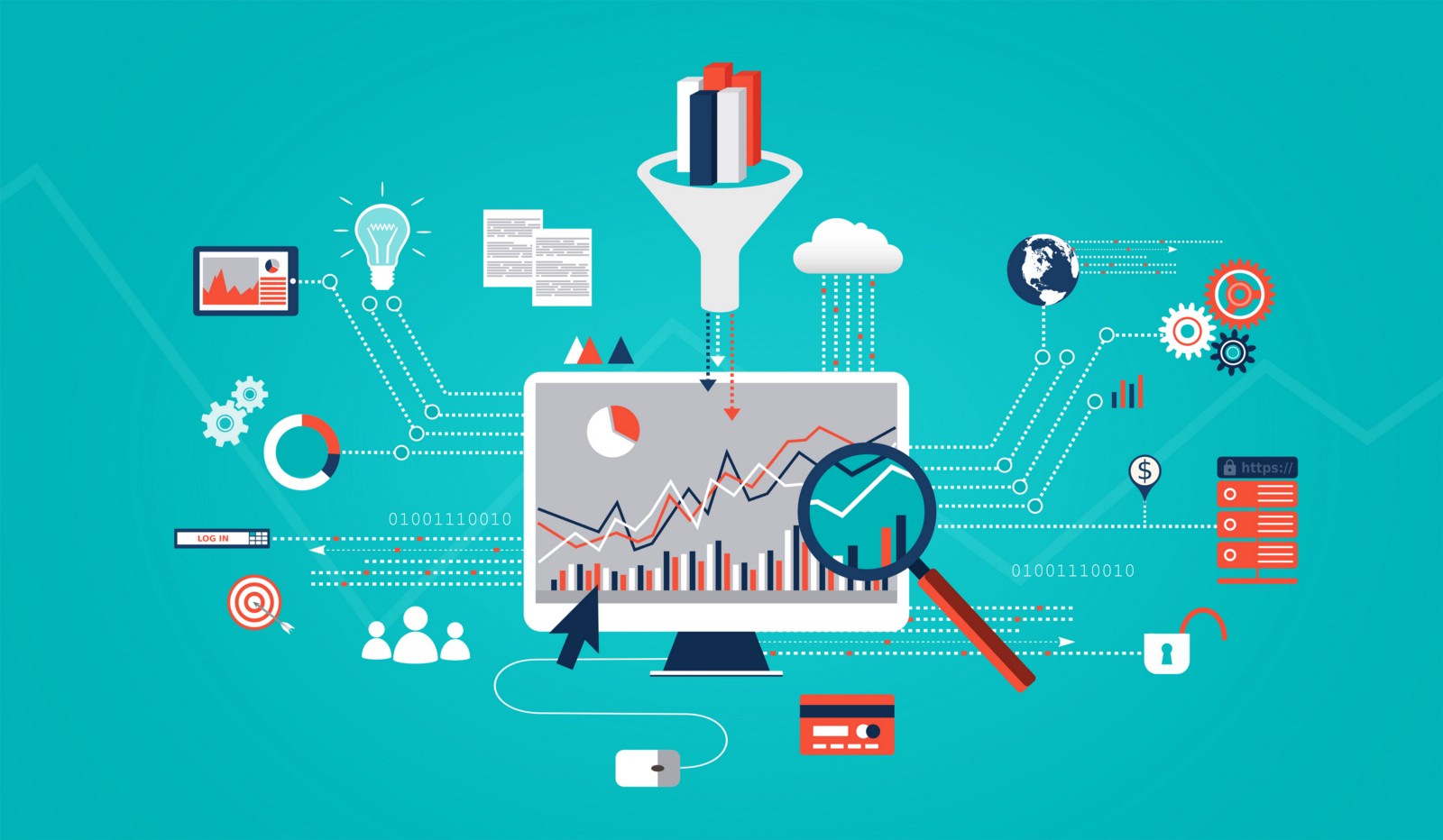
10 years. For 10 years I have been working with data. I still remember those first days when we didn’t even have that much data to work with, then Google Analytics came in and changed the way we track users. I remember the rise of apps and the attribution tools that followed to help us understand how the user found us. Compared to 10 years ago, we have become even more clueless about our users, and the worst part is that we still make decisions based on emotions – despite having so much data to support us.
Hair provides a masterclass in creating enduring value propositions. Product managers will do well to emulate these (HAAIRR) attributes into their designs.
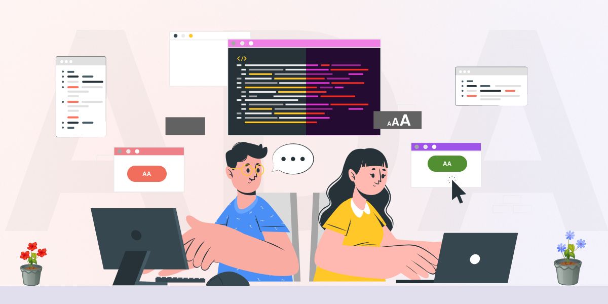
Everything boils down to customer experience today. Whether it is a mobile application or a website, there is absolutely no way you can turn a blind eye to UX and UI.
Modern education is becoming more and more digitized: while even ten years ago notebooks and printed materials were necessary for studying, all you need today is alaptop and an Internet connection. Various classroom management systems are now used for the education of all levels, from primary schools to corporate training. It is a sure way to make the learning process more efficient — for example, taking quizzes and tests online helps automate grading and provide immediate access to the student’s performance.
In the first seconds of use, one application might seem more convenient because it’s easy to navigate and zoom, as well as to satisfy the user’s needs and solve their problem quickly. While comparing to another application that might look fancy and colorful but at the same time will confuse or even worse — distract the user. And of course, it will bring zero-value to them.
Get valuable insights on designing user-friendly in-app chat UIs. Learn the dos and don'ts, best practices, and tips on simplifying, enhancing UX with color and
What makes the user interface ethical? Give the user enough options, that they keep their autonomy. But not too many, that they become paralysed by choice.
Learn how to scale Gen Z-focused apps with authenticity, AI personalization, and niche community monetization. Insights from apps with millions of users.
Manual frame layout. Instead of relying on AutoLayout, you calculate and set frames explicitly. Yes, it means writing more code, but the tradeoff is speed.
An accessibility audit is the process of performing manual and automated tests on your website to find out the improvement areas. There are 6 different types.
An E-commerce web design that user would find easy to shop. A good design make shopping engaging and easy for the users. And navigation is just the first step.
Most mobile and cross-platform web developers have encountered the problem at some point: you need your web app to scale neatly to the device screen size, regardless of which of the many thousands of devices there are out there, but your units only have one design layout width, mainly mobile. Or perhaps you need to create a per-device stylesheet for a truly scalable cross-platform UI, and want to use a scaled version of an original to base it upon. In either case, converting everything by hand is laborious and inconvenient.
This post focuses on how SaaS metrics relate to customer onboarding, company growth, and the generation of sustainable income needed and sufficient to not only stay afloat in the turbulent sea of web marketing but thrive.
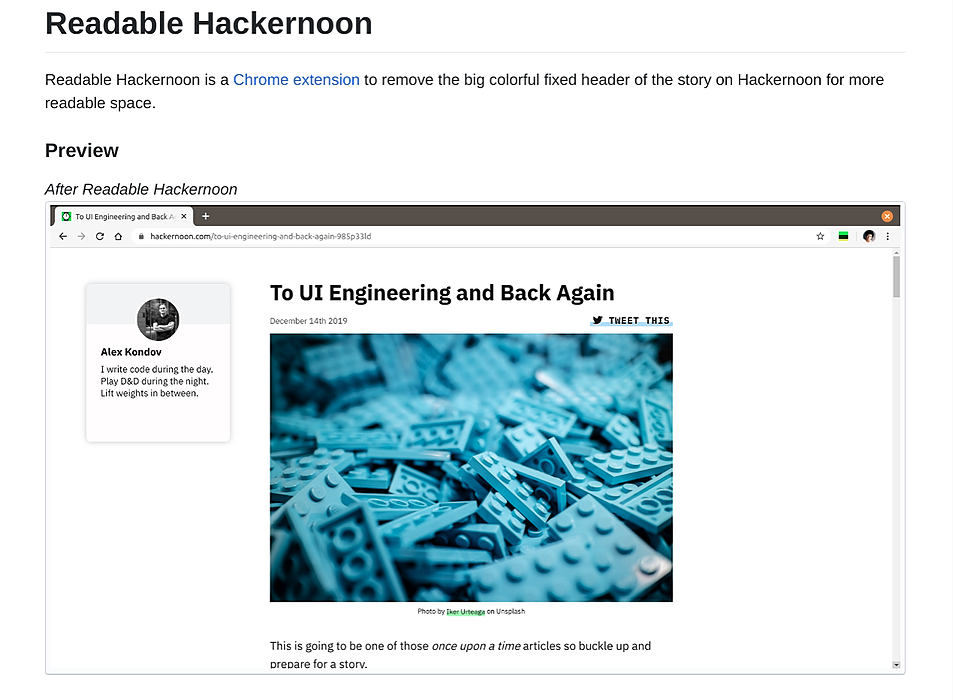
Hackernoon is my favorite source of knowledge about technology. I love reading Hackernoon story since Medium. However, the Hackernoon new site makes me harder to stay reading more stories before going to bed. It got a big bright green and yellow header on top of the story. At first, I think maybe I can scroll the page down, and it will disappear. I was wrong, it was fixed over the page and it takes a portion of the readable screen.
I am the co-founder of Flexiple and Remote Tools. In this post, I describe why I chose to use a utility-first CSS framework to build my website’s UI in a fast, robust and low-maintenance way.
What four years as the sole designer on a fintech product teaches you about depth, restraint, and the trade-offs agency work never prepares you for....
When you look at the LinkedIn profile of all successful subscription companies, you'll see a lot of people who work on checkout pages. Big companies spend 10...
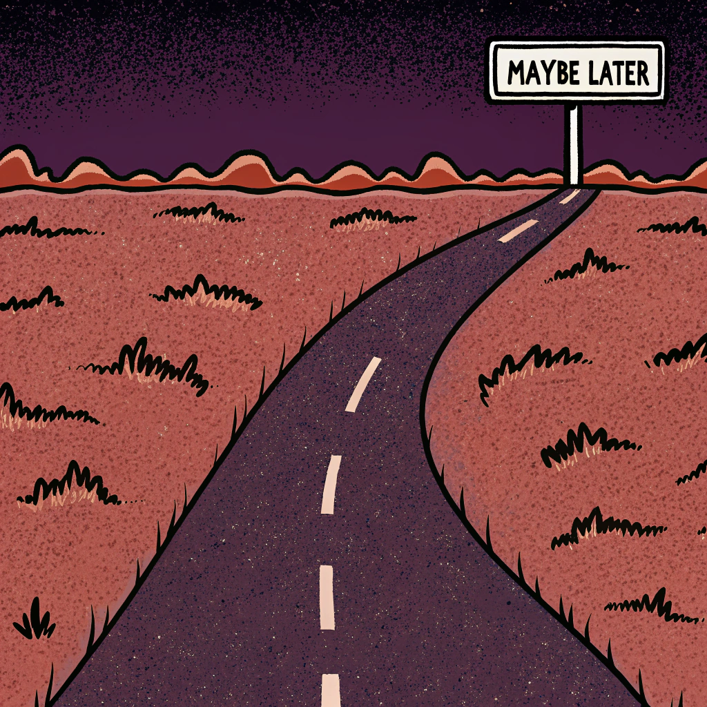
"Maybe Later" buttons feel polite but kill user success. Why that innocent onboarding escape hatch causes higher churn rates and how to design guidance user.