Rework Pro page around build-free adoption, not a feature paywall#111
Conversation
WalkthroughEnables Mermaid diagram support in Docusaurus, adds the required theme dependency, and redesigns the Pro landing page with a card-based layout, updated feature/demo sections, new messaging focused on building without upfront licensing, and refreshed upgrade steps. ChangesPro Landing Page Redesign with Mermaid
Estimated code review effort🎯 2 (Simple) | ⏱️ ~12 minutes Possibly related PRs
Poem
🚥 Pre-merge checks | ✅ 4 | ❌ 1❌ Failed checks (1 warning)
✅ Passed checks (4 passed)
✏️ Tip: You can configure your own custom pre-merge checks in the settings. ✨ Finishing Touches📝 Generate docstrings
🧪 Generate unit tests (beta)
Thanks for using CodeRabbit! It's free for OSS, and your support helps us grow. If you like it, consider giving us a shout-out. Comment |
Greptile SummaryThis PR rewrites the
Confidence Score: 4/5Safe to merge — changes are copy and layout only, with no logic, data, or routing changes that could break anything. All internal route references resolve, all CSS class names used in the TSX exist in the module, and no imports were removed. The two observations are visual: the primary CTA label ("Start building with Pro") lands on a page titled "upgrading to Pro" which may confuse net-new users, and the 5-item feature grid leaves an uneven second row in the 3-column layout. Neither blocks functionality. pro.tsx — the primary CTA destination and the 5-card grid layout are worth a quick visual check before merging. Important Files Changed
Flowchart%%{init: {'theme': 'neutral'}}%%
flowchart TD
A[Visitor lands on /pro/] --> B[Hero: kicker + install snippet\n+ Free to build callout]
B --> C{CTA choice}
C --> D["Start building with Pro\n→ /docs/pro/upgrading-to-pro"]
C --> E["See the live RSC demo\n→ rsc.reactonrails.com"]
C --> F["Pro docs overview\n→ /docs/pro"]
A --> G[What Pro adds\n5-card feature grid]
A --> H[See everything before you commit\n3-card proof links]
H --> H1[Live RSC demo]
H --> H2[Marketplace demo repo]
H --> H3[Pro example app]
A --> I[Three steps to build with Pro\n+ License model card]
I --> J{Ready to ship?}
J -->|Yes| K[pro.reactonrails.com\npaid license]
J -->|Budget-constrained| L[Email justin@shakacode.com\nfree/low-cost license]
Reviews (1): Last reviewed commit: "Rework Pro page around build-free adopti..." | Re-trigger Greptile |
![greptile-apps[bot]](https://avatars.githubusercontent.com/in/867647?s=60&v=4)
| <div className={styles.actions}> | ||
| <Link className="button button--primary button--lg" to={docsRoutes.proUpgrade}> | ||
| Review the upgrade guide | ||
| </Link> | ||
| <Link | ||
| className="button button--secondary button--lg" | ||
| to={docsRoutes.proOverview}> | ||
| Open Pro docs overview | ||
| Start building with Pro |
There was a problem hiding this comment.

The primary button label says "Start building with Pro" but navigates to /docs/pro/upgrading-to-pro. A user who has never used the OSS gem will encounter a page framed around upgrading from OSS, which conflicts with the new "install and start fresh" messaging in the hero. Consider linking to a general getting-started or Pro overview page instead (docsRoutes.proOverview), or renaming the destination page — otherwise the label sets an expectation the landing page doesn't satisfy.
Note: If this suggestion doesn't match your team's coding style, reply to this and let me know. I'll remember it for next time!
There was a problem hiding this comment.
Good catch — fixed in 41e410c. The primary CTA now links to /docs/pro/installation (added docsRoutes.proInstall) so 'Start building with Pro' lands on a fresh-install page that matches the hero's install-and-build framing, rather than the upgrade-from-OSS guide.
| <div className={styles.cardGrid}> | ||
| {proFeatures.map((feature) => ( | ||
| <article className={styles.featureCard} key={feature.title}> | ||
| <h3>{feature.title}</h3> | ||
| <p>{feature.description}</p> | ||
| </article> | ||
| ))} | ||
| </div> |
There was a problem hiding this comment.
cardGrid is declared as repeat(3, minmax(0, 1fr)), but proFeatures has 5 items. This renders 3 cards on row 1 and 2 left-aligned cards on row 2, each occupying only 2/3 of the available width. Consider using a 5-column layout, reducing to 4 features, bumping to 6, or applying grid-column: span 1 with a centering wrapper so the orphan cards don't leave a blank third column.
There was a problem hiding this comment.
Fixed in 41e410c. Switched .cardGrid from a 3-column grid to centered flex-wrap with a thirds-based card width, so the 5-card 'What Pro adds' second row (2 cards) centers cleanly instead of leaving an empty third slot. The 3-card proof grid still fills a single row. Verified in a production build screenshot.
Two follow-ups from automated review on PR #111:

- "Start building with Pro" now links to /docs/pro/installation instead of
  the upgrade-from-OSS guide, matching the install-and-build-fresh framing.
  Adds docsRoutes.proInstall.
- The "What Pro adds" grid had 5 cards in a 3-column layout, leaving an
  empty third slot on the second row. Switched .cardGrid to centered
  flex-wrap so the orphan row centers cleanly; the 3-card proof grid is
  unaffected.

Verified with npm run build (success, no new broken links); the built
/pro/ HTML confirms the CTA href is /docs/pro/installation.

Co-Authored-By: Claude Opus 4.8 (1M context) <noreply@anthropic.com>
|
You have reached your Codex usage limits for code reviews. You can see your limits in the Codex usage dashboard. |
|
Cloudflare preview deployed.
|
|
You have reached your Codex usage limits for code reviews. You can see your limits in the Codex usage dashboard. |
|
You have reached your Codex usage limits for code reviews. You can see your limits in the Codex usage dashboard. |
Co-Authored-By: Claude Opus 4.8 (1M context) <noreply@anthropic.com>
|
You have reached your Codex usage limits for code reviews. You can see your limits in the Codex usage dashboard. |
Update: demo consistency, tighter copy, Mermaid diagramsThis iteration fixes the demo/proof inconsistencies, cuts repeated copy, and turns on Mermaid rendering. Demos — the proof section is now two real demos, each with a live app + source, instead of three tiles (the old layout split LocalHub's live demo and its repo into separate tiles, and showcased the
Copy — removed licensing / "build-free" repetition that appeared up to 5×. Hero highlight now covers the free side, the license card the paid side, no overlap. Feature grid rebalanced 7 → 6 (no orphan card). Hero CTAs 3 → 2 (the live demo moved into the demo section). Mermaid — added Pro page — before / after (desktop)Before:
After:
After — mobile
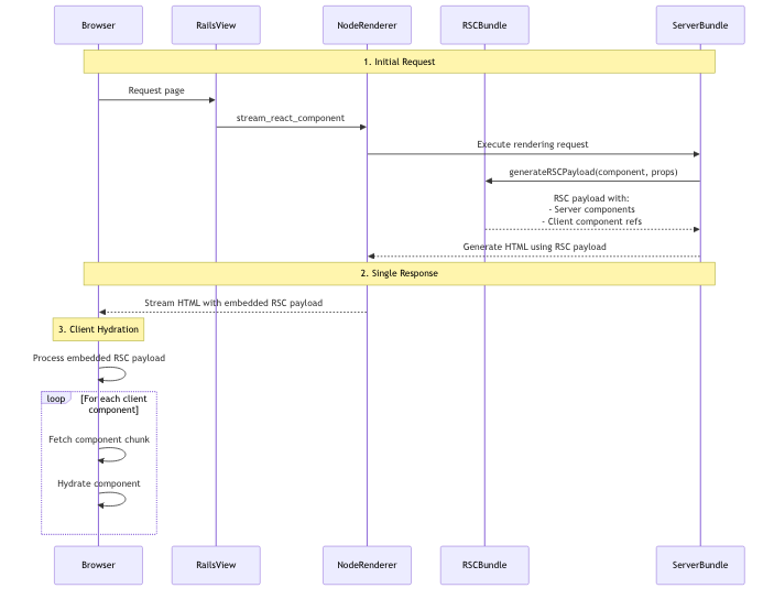
RSC rendering-flow diagram now renders (was a raw code block)
|


The /pro/ page framed React on Rails Pro as a locked-feature tier you
unlock by paying. That misrepresents the product: the gem and npm package
are public (bundle add react_on_rails_pro), nothing is access-gated, and an
unlicensed app keeps running and just logs its license status. A license
covers production use and maintainer support, not access.

Changes to prototypes/docusaurus/src/pages/pro.tsx (+ pro.module.css):

- Replace the misleading "Feature Comparison" OSS-vs-Pro table with an
  honest "What Pro adds" feature list: React Server Components, Streaming
  SSR, Fragment caching, dedicated Node renderer, and code splitting +
  bundle caching (the canonical "What Pro Adds" list from the upstream
  docs).
- Drop the two rows that implied documentation and the public RSC demo
  were paywalled ("React Server Components performance guides" and the
  "view-only" demo row). Guides and demos are public to everyone.
- Add a "See everything before you commit" section linking the public
  proof: the live RSC performance demo, the marketplace demo repo + its
  performance guide, and the Pro example app.
- Lead the hero with `bundle add react_on_rails_pro` and a "Free to build
  with" note; make "Start building with Pro" the single primary CTA and
  trim the hero from four competing buttons to three.
- Fix the false "Performance tier, not separate product" kicker. Pro is a
  separate, additive gem that depends on the OSS gem.
- Reword the three-step upgrade path to be build-first: add the gem, turn
  on the features you need, then license for production.

Verified with a local production build (npm run build) and a rendered
screenshot of /pro/; no new broken links or console errors.

Co-Authored-By: Claude Opus 4.8 (1M context) <noreply@anthropic.com>
Two follow-ups from automated review on PR #111:

- "Start building with Pro" now links to /docs/pro/installation instead of
  the upgrade-from-OSS guide, matching the install-and-build-fresh framing.
  Adds docsRoutes.proInstall.
- The "What Pro adds" grid had 5 cards in a 3-column layout, leaving an
  empty third slot on the second row. Switched .cardGrid to centered
  flex-wrap so the orphan row centers cleanly; the 3-card proof grid is
  unaffected.

Verified with npm run build (success, no new broken links); the built
/pro/ HTML confirms the CTA href is /docs/pro/installation.

Co-Authored-By: Claude Opus 4.8 (1M context) <noreply@anthropic.com>
The Pro feature grid listed generic "Streaming SSR" and "Fragment
caching" but omitted the streaming-performance work that actually
shipped in React on Rails Pro: parallel rendering via
async_react_component, immediate hydration, and caching that covers
streamed components. Name these real capabilities so the page reflects
what Pro does, and sharpen the RSC, streaming, and Node-renderer
descriptions to match.

Co-Authored-By: Claude Opus 4.8 (1M context) <noreply@anthropic.com>
Rework the Pro marketing page for consistency and concision, and turn on
Mermaid rendering across the docs.

Pro page (pro.tsx / pro.module.css):
- Replace the three-tile proof section with two real demos, each linking to
  both a live app and its source: LocalHub (RSC performance) and the new
  TanStack starter. The old layout split LocalHub's live demo and its repo
  into two separate tiles and showcased the spec/dummy CI fixture as an
  example app.
- Drop the spec/dummy CI test app from the marketing page.
- Cut repeated licensing / build-free copy that appeared up to five times.
  The hero highlight now covers the free side and the license card the paid
  side, with no overlap.
- Merge Immediate hydration into Streaming SSR so the feature grid is a
  balanced 3x2 (6 cards) instead of 7 with an orphan.
- Reduce three competing hero CTAs to two; the live demo now lives in the
  demo section.

examples.tsx:
- Add the TanStack starter (live demo + source repo), the strongest current
  example, which was missing from the page.

Enable Mermaid (docusaurus.config.ts / package.json / lockfile):
- Add @docusaurus/theme-mermaid and markdown.mermaid. This renders the
  existing RSC rendering-flow sequence diagram, which previously shipped as a
  raw code block, and unblocks diagrams synced from the upstream docs.

Co-Authored-By: Claude Opus 4.8 (1M context) <noreply@anthropic.com>
Co-Authored-By: Claude Opus 4.8 (1M context) <noreply@anthropic.com>
 justin808
force-pushed
the
jg-conductor/review-pro-page-content
branch
from
justin808
force-pushed
the
jg-conductor/review-pro-page-content
branch
from
c1b8ec1 to
4110efd
Compare
![coderabbitai[bot]](https://avatars.githubusercontent.com/in/347564?s=60&v=4)
1 participant
What & why
The
/pro/page presented React on Rails Pro as a locked-feature tier you unlock by paying. That doesn't match the product:bundle add react_on_rails_pro(RubyGems: ~26.7k downloads; npmreact-on-rails-pro).So the old "Feature Comparison" table was misleading, and two rows in particular ("React Server Components performance guides — OSS: Docs only / Pro: Included" and "Public RSC demo — view-only / Pro: Included implementation patterns") implied documentation and a public demo were paywalled.
Changes (
pro.tsx+pro.module.css)react_on_railsunified CHANGELOG). The grid now names the capabilities that actually shipped instead of two generic bullets: React Server Components, Streaming SSR with Suspense (stream_react_component), Concurrent component rendering (async_react_component, parallel renders through the Node renderer), Immediate hydration (hydrate as HTML streams in; auto-enabled on Pro), Streaming-aware caching (fragment + prerender caching that covers streamed components), dedicated Node renderer (Fastify pool), and code splitting + bundle caching.bundle add react_on_rails_pro+ a "Free to build with" note. Single primary CTA "Start building with Pro" (hero trimmed from 4 competing buttons to 3).Aligns with the goal of maximizing adoption: build with all of it for free, license when you ship to production.
Before / after
npm run build) passes with no new broken links, and/pro/renders with no console errors. Before/after screenshots were captured from a local dev build and reviewed in the working session. (Happy to attach them here on request — GitHub needs a web/API upload that the CLI can't do.)Test plan
npm run buildsucceeds (pre-existing broken-anchor warnings in synced upstream docs are unrelated to this page)tsctypecheck passes/pro/renders, no console errors/docs/pro,/docs/pro/upgrading-to-pro) resolve; external links point at the public gem/demo/reporeact_on_railsCHANGELOG (async_react_componentPR 2139, concurrent streaming PR 2015, immediate hydration v16.2.0,cached_stream_react_component)🤖 Generated with Claude Code
Note
Low Risk
Marketing page, CSS, and optional Mermaid docs dependency only; no auth, API, or production app logic changes.
Overview
Reworks the React on Rails Pro marketing page so adoption is build-first, not a paywalled feature tier: the hero leads with
bundle add react_on_rails_pro, a Free to build with note, and CTAs aimed at Pro installation docs instead of upgrade-only flows.Content and layout: Drops the OSS-vs-Pro comparison table in favor of a What Pro adds card grid (RSC, streaming SSR, async rendering, caching, Node renderer, code splitting) with links into Pro docs. Adds a See it running, read the source section for the RSC marketplace and TanStack starter demos, reframes the three-step path as add gem → enable features → license for production, and tightens licensing copy (license = production + support, not access).
Site wiring: Extends
docsRouteswith Pro doc paths used by the new cards and primary CTA. Styles add install snippet, feature/demo card grids, and responsive card layout (replacing table styles).Docs tooling: Adds
@docusaurus/theme-mermaid, enablesmarkdown.mermaid, and updates lockfiles (including a minimal rootpackage-lock.json).Reviewed by Cursor Bugbot for commit 45cc017. Bugbot is set up for automated code reviews on this repo. Configure here.
Summary by CodeRabbit
Release Notes
New Features
Documentation